Vancity Sushi
Project: Mobile Customer Loyalty Application
Role: UX Designer, UX Researcher, Visuals, Interaction — with a focus on Moderated Usability Testing
Timeline: 3 Weeks
Project Vision
Vancity Sushi is a fictional, trendy sushi restaurant in the Lower Mainland of British Columbia, Canada.
Vancity Sushi's customer loyalty mobile app aims to transform the online ordering experience for its prospective and returning customers.
Customers can place an order through the app for pick‐up or delivery and accumulate points for future purchases.
Challenges
Vancity Sushi's current online ordering website is not accessible for users in the following ways:
- Lacks a familiar, mobile‐friendly experience
- Images for menu items are inconsistent or absent, making it difficult for customers to visualize the food
- Not straightforward, thus, not “easy” to use
Empathize
Researching
Before launching, we need to understand specific challenges users may face when placing an order and accumulating points and how we can resolve those challenges.
My first steps started with empathizing with the users through storyboarding the big picture and a close‐up scenario before defining the research goals and questions to address.
Research Goals: Determine if users can easily complete orders and accumulate points within the app.
Research Questions:
- How many transactions are completed through the mobile app? Are the users logged in or guests?
- How long does it take for users to complete a transaction?
- Which parts do users get stuck on? Why?
- How immediately do users choose to redeem points for their orders?
- How can we learn from the steps users take to place an order?
Competitive Analysis & Pain Points
While I gathered information about the users, I also learned about the direct and indirect competitors of Vancity Sushi.
Besides other food ordering apps like UberEats and SkiptheDishes, Vancity Sushi's direct competitors are the nearby restaurants that use a website ordering platform to process online orders.
The primary weaknesses I noticed among the competitors are:
- Lack of written descriptions and audio options
- Inconsistency with images for visual aid
- No mobile app is available (or mobile app is available in certain locations)
- Absence of a “Notes” field to specify food allergies or dietary preferences
- Missing updated Points page after purchase
Meet the Persona
The user research process began with interviewing 5 participants who have busy schedules as full‐time employees, business owners, or students. After learning more about the type of users and their experiences using existing customer loyalty programs, I created two personas to guide the project.
Persona 1: Mikayla Yang
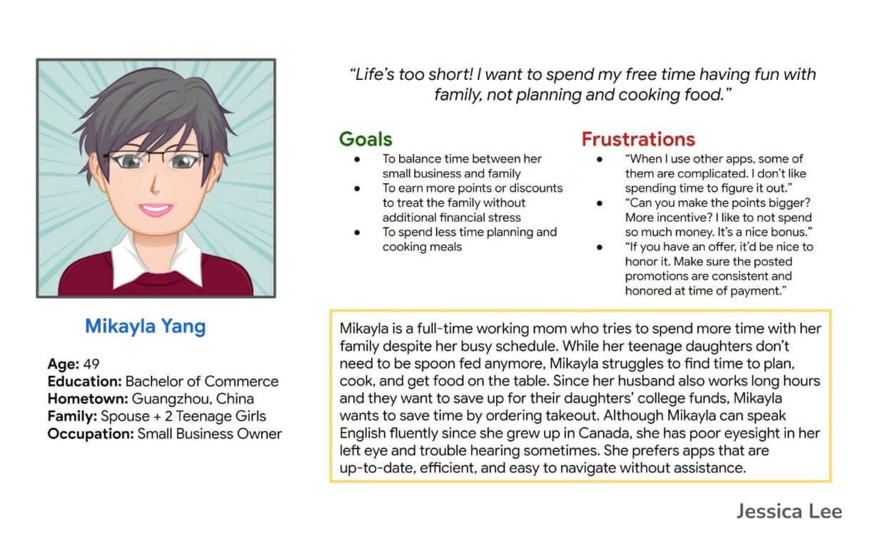
Persona Summary for Mikayla Yang, full‐time working mother & small business owner
As a full‐time working mother and small business owner, Mikayla's top goals and frustrations include the following:
Goals:
- To balance time between her small business and family
- To Learn more points or discounts to treat the family without additional financial stress
- To spend less time planning and cooking meals
Frustrations:
- “When I use other apps, some of them are complicated. I don't like spending time to figure it out.”
- “Can you make the points bigger? More incentive? I like to not spend so much money. It's a nice bonus.”
- “If you have an offer, it'd be nice to honor it. Make sure the posted promotions are consistent and honored at the time of payment.”
Persona 2: Carl Dela Cruz
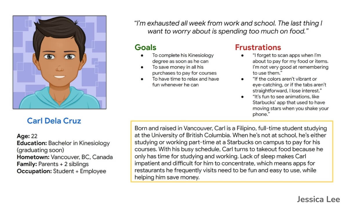
Persona Summary for Carl Dela Cruz, part‐time employee & full‐time student
As a part‐time employee and full‐time student, Carl's top goals and frustrations include the following:
Goals:
- To focus on and complete his Kinesiology degree as soon as he can to start working full‐time and earn money
- To save money in all his purchases to pay for courses
- To have time to relax and have fun whenever he can (since he's either studying or working for most of his time)
Frustrations:
- “I forget to scan apps when I'm about to pay for my food or items. I'm not very good at remembering to use them.”
- “If the colors aren't vibrant or eye‐catching, or if the tabs aren't straightforward, I lose interest.”
- “It's fun to see animations, like Starbucks' app that used to have moving stars when you shake your phone.”
My Assumptions
My assumptions before the research phase are that the participants order sushi at least once a week (or a few times a month) and prefer to gather and use points to save money on future orders.
Learning about how some customers forget to log into the app to accumulate points changed my assumptions. I also learned that avid point‐acquiring customers prefer to have more point promotions weekly rather than a static system.
Outlining the Journey
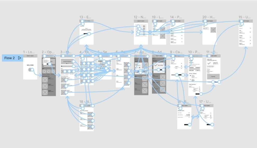
After gathering information about the users and the competitors, it is time to begin outlining the journey. I constructed a user flow and user flow diagram to outline the steps a user would take to place an order through the app.
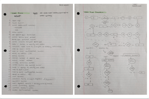
User Flow and User Flow Diagram from opening the app to order confirmation
Working on and iterating the User Flow helped me visualize the process, identify missing steps, and understand the successes and frustrations users may face along the way.
I worked on the User Flow activity using the pen‐and‐paper method, or pencil‐and‐paper method in this attempt, as I found it easier for me to output ideas as quickly as I could.
After outputting the ideas onto a page, I can then revise and reorganize each point to create a final and cleaner draft to refer to.
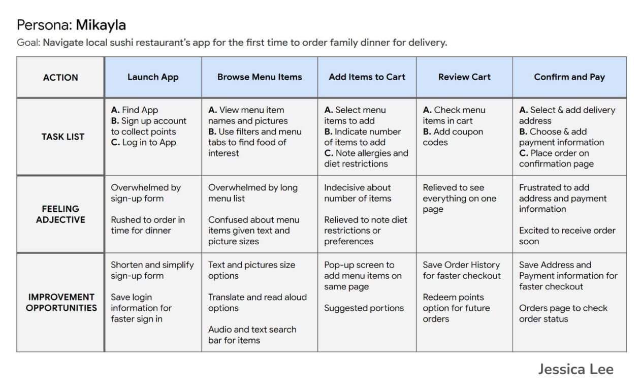
User Journey Map for Mikayla Persona
Following the User Flow activity, I brainstormed a specific scenario a user, such as the Mikayla persona, may take to order through the app.
Creating the User Journey Map helped me empathize with the user and persona better because I worked through the subtasks within each overarching task and identified specific improvement opportunities that may not have been apparent to consider before creating the wireframes.
Define
From understanding both personas, the user flow, and the user's journey, I was able to move forward with defining the goal statement for this first iteration of the Vancity Sushi App.
Goal Statement
Goal Statement for the Vancity Sushi Customer Loyalty App
The goal statement is as follows:
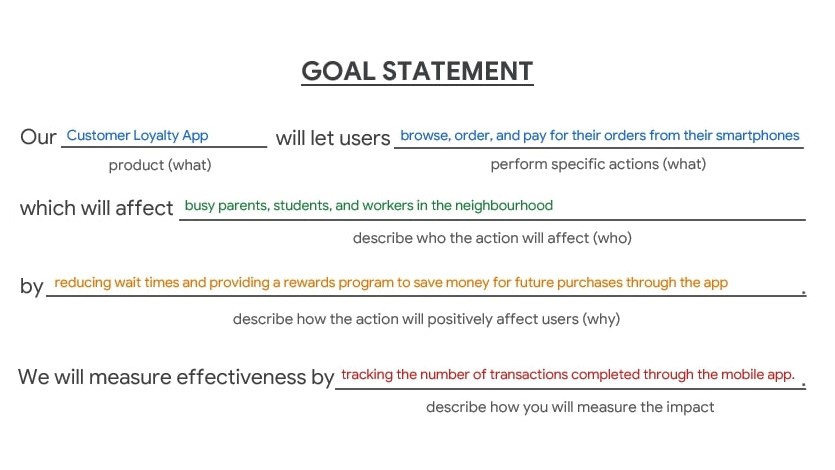
“Our Customer Loyalty App will let users browse, order, and pay for their orders from their smartphones,
which will affect busy parents, students, and workers in the neighbourhood
by reducing wait times and providing a rewards program to save money for future purchases through the app.
We will measure effectiveness by tracking the number of transactions completed through the mobile app.”
Ideate
Wireframing
I started with my handy pen and paper to output ideas using the Crazy Eights and the How Might We methods to generate ideas and return to the empathetic state of mind to prioritize the most important benefits to create features for.
By experimenting with two different methods to begin the wireframing process, I could consider other perspectives to approach the Home screen by prioritizing different features to highlight and provide value to the user.
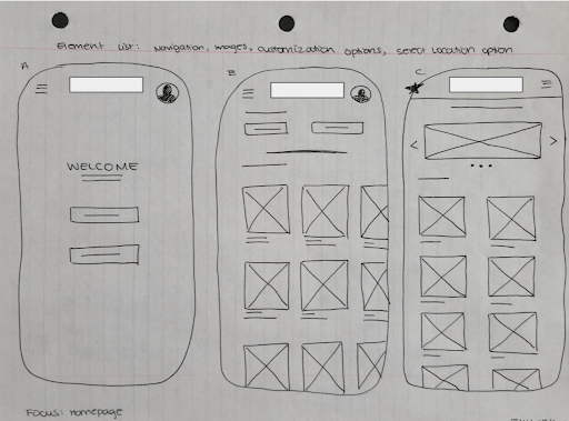
Pen & Paper Wireframe for Variations A and B for Homepage
In the pen‐and‐paper wireframe examples, I brainstormed different layouts for the Home screen and focused on outputting many ideas before revisiting the wireframes and refining a final wireframe to pursue this sprint.
For the final option, I reviewed the 5 iterations and selected the components that are the most useful for the user's needs and ordering experience to create a final pen‐and‐paper wireframe.
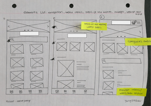
Pen & Paper Wireframe for Variations C and D for Homepage
Following the pen‐and‐paper wireframes, I repeated the above method to work on building the other screens and creating the digital wireframes for the Minimum Viable Product of the Vancity Sushi app.
Prototype
Screenshot of the wireframes for The Sweat Crew's Low‐fidelity Prototype
Through the Crazy Eights design activity, I finalized and translated the paper wireframes to digital low‐fidelity wireframes to begin prototyping the experience for the usability testing phase.
Explore the low‐fidelity prototype here first.
Style Guide
During the prototype stage, I gathered inspiration for Vancity Sushi's brand from images of sushi restaurant interior decorations and trends on sushi ordering websites.
Vancity Sushi's brand follows a simple colour scheme. Although the Welcome page uses a similar wood aesthetic as the restaurant's interior design, the customer loyalty app needed a minimal theme to avoid an overwhelming appearance.
By only using the #EC4424 red and colours for call‐to‐action buttons and images of the food items, users are more focused on these essential components in the design.
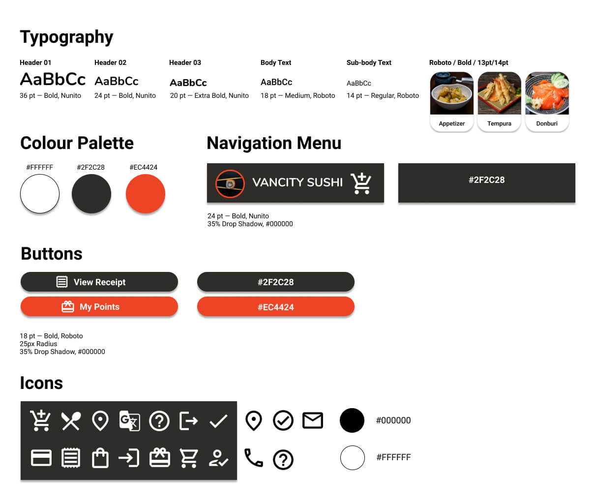
Style Guide, Style Tile (or Sticker Sheet) for The Vancity Sushi App
Test & Iterate
After creating the wireframes, I moved forward with the low‐fidelity and high‐fidelity prototypes. Following each prototype, I conducted a moderated Usability Study to learn about unaddressed pain points. Listed below are the key findings from each round.
Round 1 Key Findings:
- Users want more guidance and visual cues to navigate the app.
- Users want a simple Menu page to find everything quicker.
- Users want an Updated Payment page to understand how the points affect their purchases.
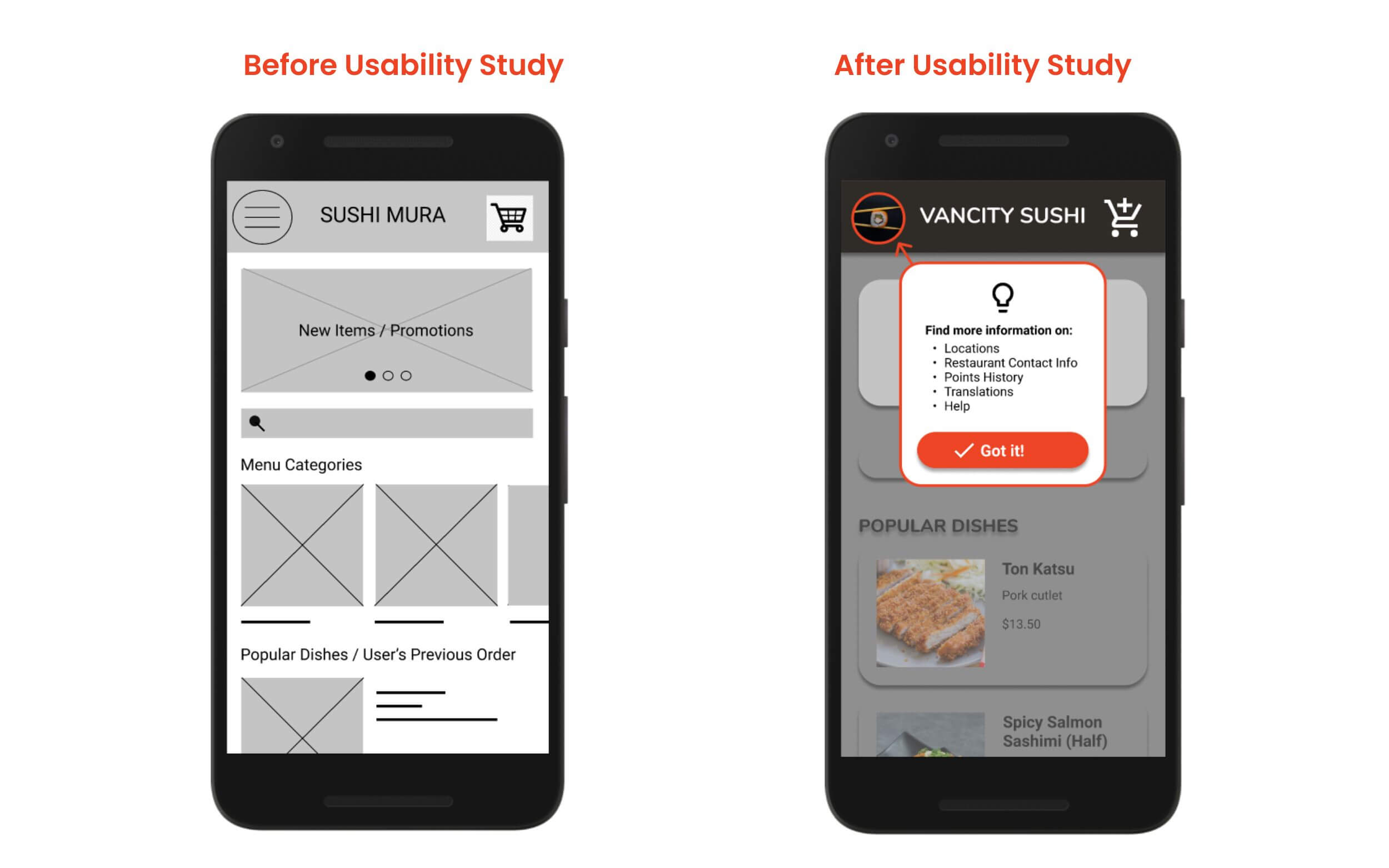
Before‐and‐After screenshots of Vancity Sushi's Home screen with and without visual cues to guide users.
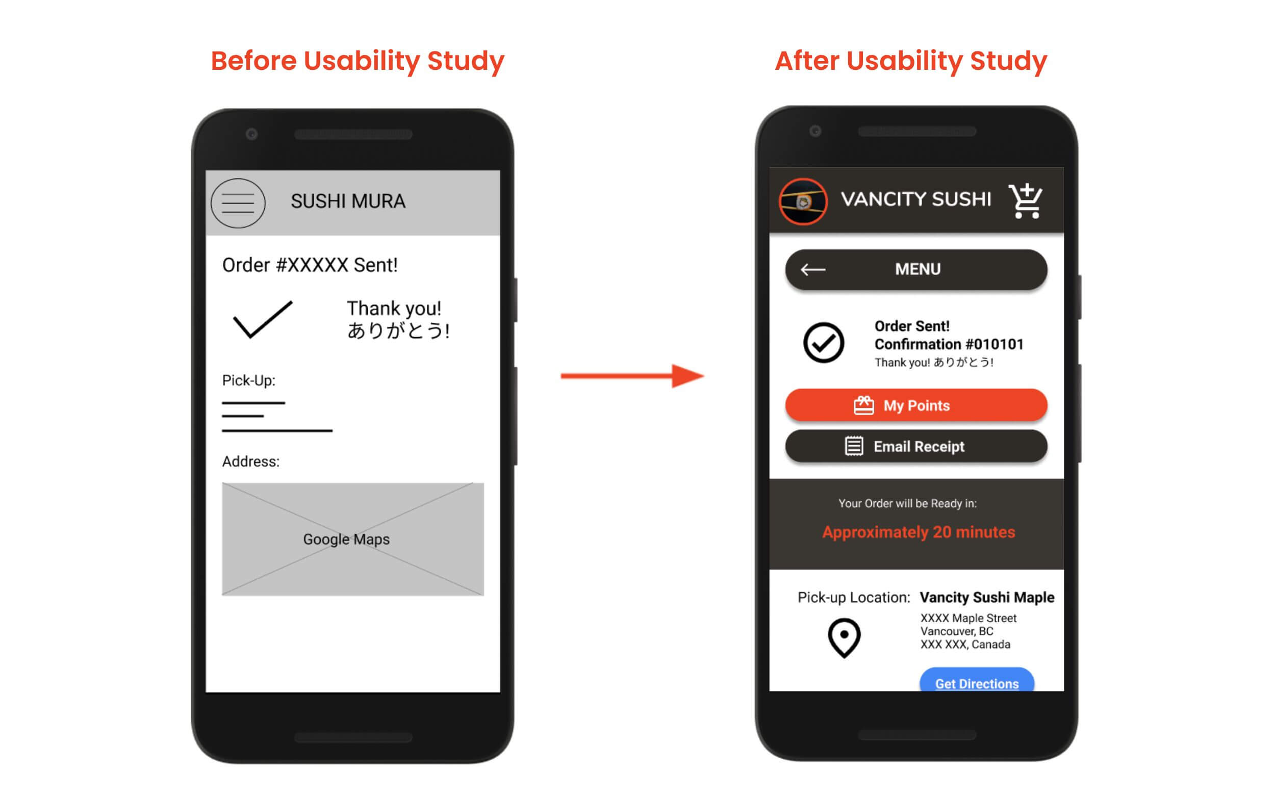
Before‐and‐After screenshots of Vancity Sushi's Order Confirmation screen with and without call-to-action buttons, estimated order completion time, and location details.
Round 2 Key Findings:
- Users want an option to remove items from the Cart when they change their minds about the items.
- Users want to know where and when Address information is requested for the Delivery option and additional fees.
- Users want to see Blank Fields on the Payment page to have the option to select fields to complete.
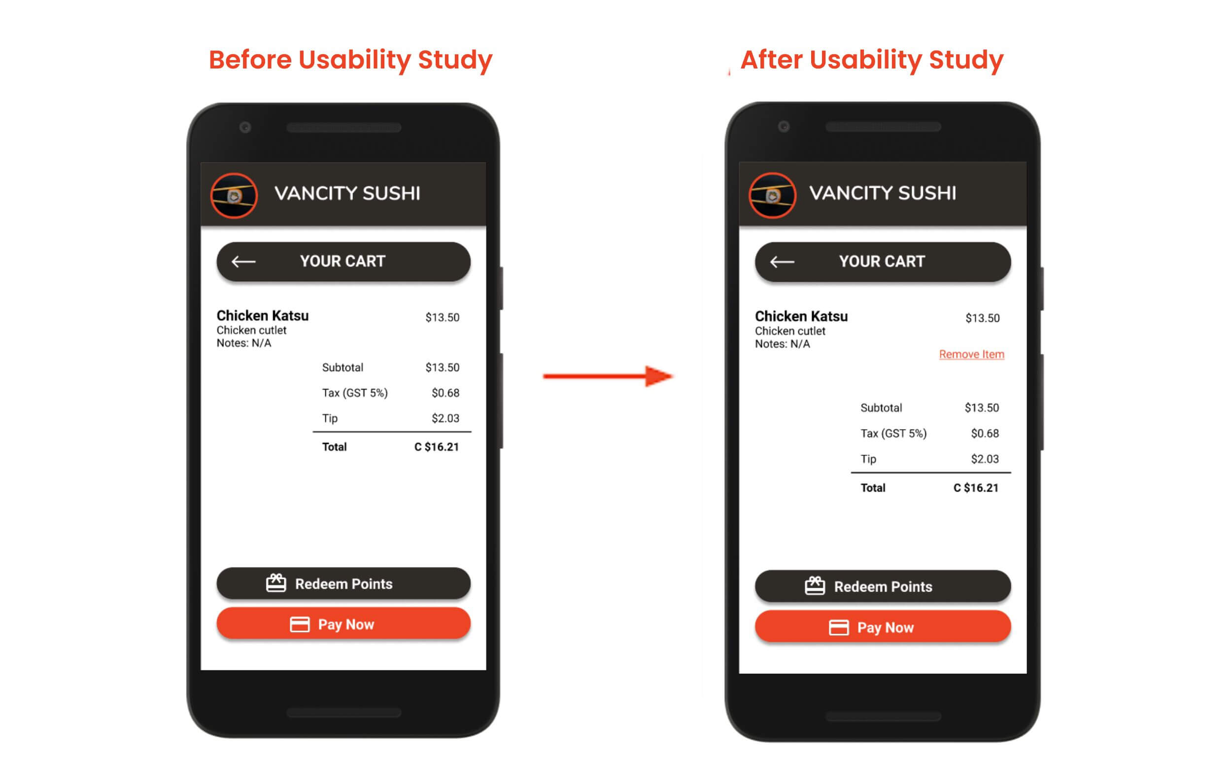
Before‐and‐After screenshots of Vancity Sushi's Cart screen with and without the Remove Items button.
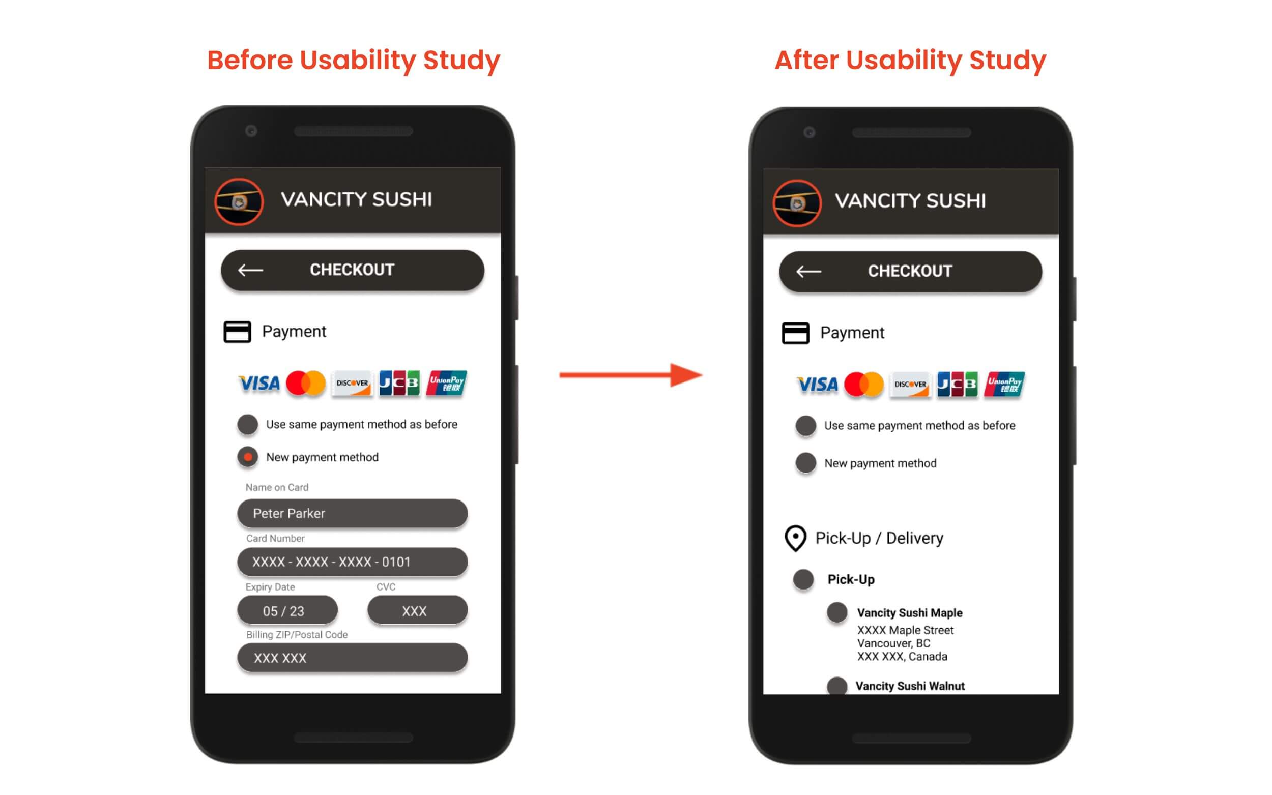
Before‐and‐After screenshots of Vancity Sushi's Payment screen with the payment fields expanded after each step rather than all expanded to reduce excessive scrolling.
Reflecting on the Challenges
From reviewing how the changes impacted the users' experiences between usability study #1 and usability study #2, I revisited how the overall design for these two sprints addressed the challenges defined at the beginning of this project.
Challenge 1: Familiar, mobile-friendly experience
Vancity Sushi's competition becomes more tense as more restaurants turn to food apps to keep their customers.
One advantage Vancity Sushi has is the familiar and mobile‐friendly experience with a clutter‐free layout.
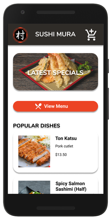
Vancity Sushi's App Homepage
Challenge 2: Inconsistent or absence of Images in Menu
When Vancity Sushi launched its website ordering platform, the main focus was on receiving the order.
With the help of images, users have an improved ordering experience now that they have a visual aid for the menu items they are browsing.
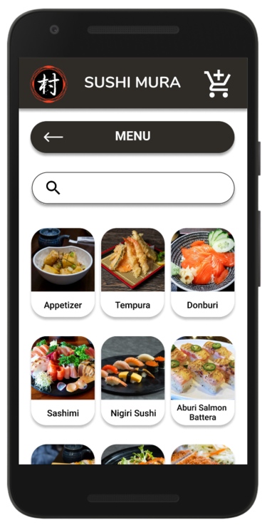
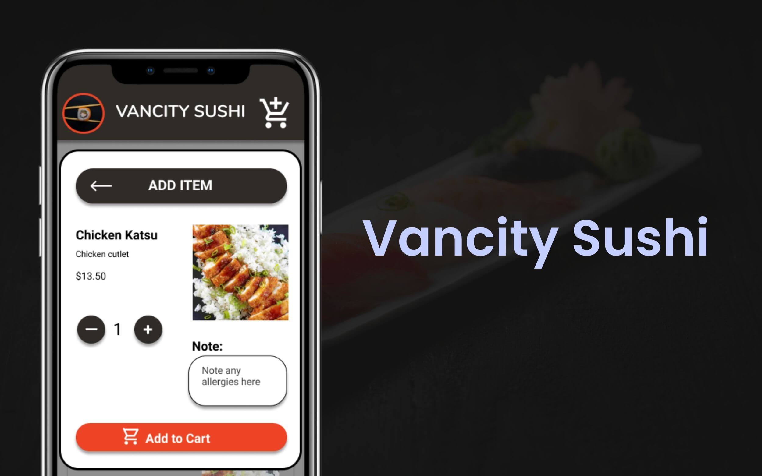
Vancity Sushi's App Product Page
Challenge 3: Simple and easy to use
The most important factor to consider is the user‐friendly component.
Vancity Sushi's app focuses on making the experience easy and simple to use with navigation cues and high‐contrast call‐to‐action buttons with icons for accessibility.
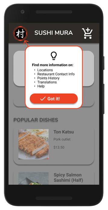
Vancity Sushi's App Navigational Cues
To view the changes, check out the high‐fidelity prototype here.
Takeaways
The simple design and quick checkout process in the Vancity Sushi app helped users place an order without a hassle.
One quote from user feedback:
“Seeing what to redeem, details for [the] confirmation [page], and all the colours and pictures… the app is easy to use. I would recommend this app to a family or friend.”
— Usability Study Participant
🌱 What I Learned
When designing Vancity Sushi's app, I learned to prioritize the essential components first to create a simple‐to‐use platform for users to place an order quickly.
Through usability studies, I learned which components were helpful, and how other elements deterred users from completing the task.
Speaking to participants helped me learn about various users' perspectives to understand how different backgrounds, upbringings, and lived experiences influence what they want and how they interact with the app.
📌 Next Steps
While the latest high‐fidelity prototype has a more presentable appearance, there is room for improvement. With more time and research, here are a few steps I would like to take to upgrade the app.
- Add a Reminder or Notification Nudge when in-store: This feature would assist personas like Carl to remind them to scan their customer loyalty app when they are near a store location using in-app GPS detection to encourage users to scan to save their points and benefit from future discounts.
- Add Detailed Descriptions: Providing more details for item descriptions will clarify what a dish is for users unfamiliar with it or who need to check ingredient details for dietary and allergy reasons.
- Include a Profile Page: Having a Profile page will help returning users update billing and delivery information for a speedy checkout process in the future.
- Conduct Another Usability Study: Learning more about pain points that have not been addressed yet from more users will help determine any new areas of need.
🌿 Thank you for reviewing my work! If you have questions or would like to chat with me about my process, connect with me on LinkedIn! I look forward to learning from your thoughts and feedback. 🥳