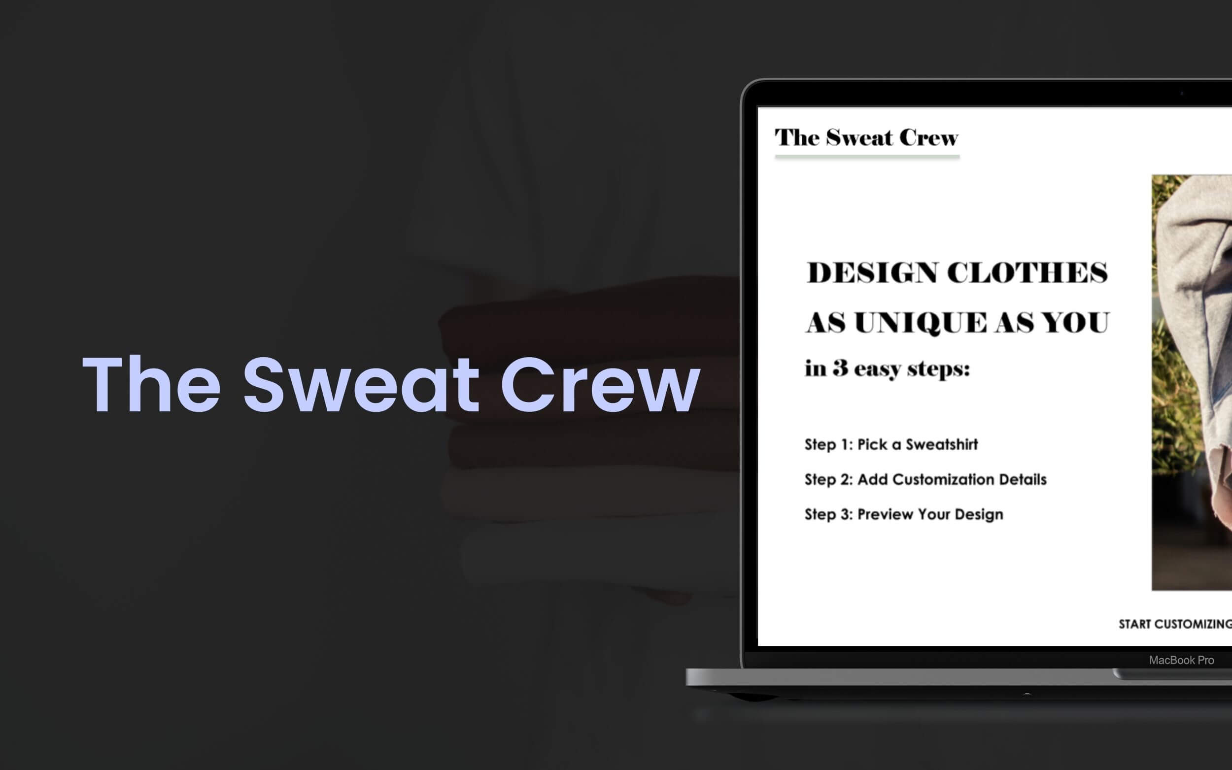
The Sweat Crew
Project: Responsive Website Design
Role: UX Designer, UX Researcher, Visuals, Interaction — with a focus on Moderated Usability Testing
Timeline: 4 Weeks
Project Vision
The Sweat Crew's website focuses on helping customers of all genders between the ages of 18 to 50 design and print customized sweatshirts.
Establishing their website provides prospective and returning customers with a centralized digital space to learn more about The Sweat Crew's products and unique services.
Challenges
Being an imaginary e‐commerce store, The Sweat Crew did not have an online presence to connect with potential customers and launch the custom sweatshirt business.
The main challenges to overcome include the following:
- Design a responsive website for multiple screen sizes
- Simple ordering process as it is a customization service
- Make the website easy to use and navigate to make a strong first impression
Empathize
Researching
From chatting with users who frequently shop online to users who are interested in purchasing customized clothing, the research process for this project required a more narrow focus than the Vancity Sushi project.
Research Goals: While the ultimate goal is to create a usable, responsive website for various screens, the other priority is to make the experience straightforward, accessible, and user‐friendly.
By keeping these goals in mind, the primary needs of the users and the company will be met.
Research Questions:
- How does a user feel about navigating the website?
- What challenges do users face when browsing the products and placing an order?
- What are some ways to improve the experience?
- How likely would users return to place another order in the future based on their experience?
- What are the unidentified pain points in the low‐fidelity prototype?
Research Findings & Pain Points
The User Research process started with looking for direct and indirect competitors. I wanted first‐hand experience understanding a user's process when searching for and ordering custom clothes.
My assumption before the research was that users would want a simple process to add design details based on the thought that there could be several components to specify for a custom order.
After learning about the competitors and potential users, I gained insight into the pain points of the product and process.
The 3 central pain points users commented on when shopping for customized items online are as follows:
- Can't Visualize End Product: Some participants found it challenging to visualize the final product of a custom design when there were not enough sample reference photos.
- Limited Selection: Some participants felt concerned about a limited selection of design styles, which led them to abandon their orders.
- Long Shopping Experience: Having a simple checkout process is favoured by all participants as there are various components to remember during the ordering process.
In addition to the initial challenges previously outlined, these pain points provide a more narrow focus.
Identifying pain points helps designers like myself learn how designers to make custom ordering experiences more enjoyable, especially since a lot of details are needed to complete the order.
Competitive Analysis
As for the competitors, The Sweat Crew's business model overlapped with several direct and indirect local businesses but also differed in other ways.
Most local businesses focused on bulk custom orders for school jerseys, uniforms, and company-branded clothing. Other local merchants combined their custom printing clothing business with a department store.
Although The Sweat Crew also focuses on customized clothing, the e-commerce store focuses on a business-to-customer transaction. The Sweat Crew's competitors are more business-to-organization focused.
The primary weaknesses observed include the following:
- Lack of visual appeal for the average consumer
- Too many pop‐up windows overwhelm the visual layout
- Limited customization options
- Multiple windows are required for the ordering process, which takes too long to load on the page, therefore slowing the momentum of the shopping experience
Meet the Persona
The target audience and demographic for ordering customized clothing (that is not for bulk jersey or school uniform orders) fall under the 18 to 50 years of age bracket.
I spoke with 5 participants who fit this demographic to learn about who they are, their goals for life, and any frustrations they may experience when ordering online.
After gathering and organizing the participants' thoughts and feelings, I created the “Ann Byrne” persona to represent the target audience for this project.
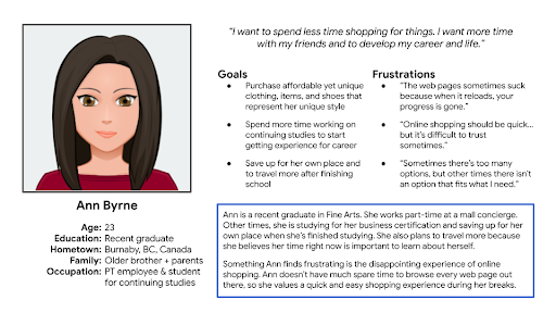
Persona Summary for Ann Byrne
Ann is a busy part‐time employee and student. She needs a quick, simple, and easy online shopping experience. A user-friendly experience aligns with Ann's values of saving time and money when acquiring customized items, clothing, and shoes that reflect her unique personality.
The top goals and frustrations of this persona include the following:
Goals:
- Purchase affordable yet unique clothing, items, and shoes that represent her unique style
- Spend more time working on continuing studies to start getting experience for her career
- Save up on her own place and travel more after finishing school
Frustrations:
- “The web pages sometimes suck because when it reloads, your progress is gone.”
- “Online shopping should be quick… but it's difficult to trust sometimes.”
- “Sometimes there's too many options, but other times there isn't an option that fits what I need.”
User Story
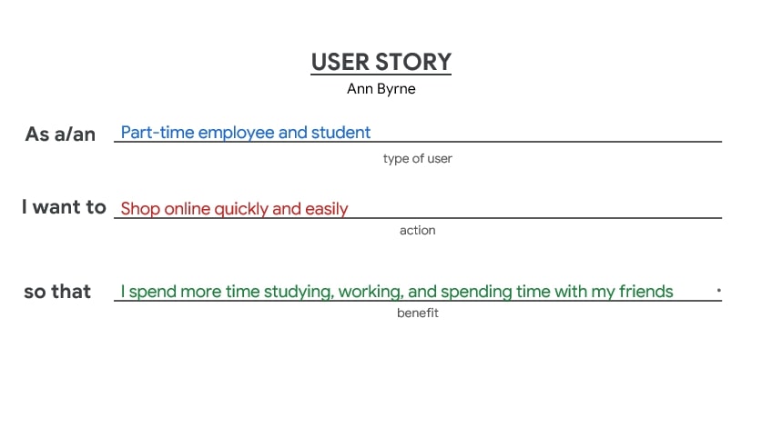
User Story for the Ann Byrne Persona
The User Story for the Ann Byrne Persona focuses on part‐time employees and students who want to shop online quickly and easily so that they can spend more time on other enjoyable activities and responsibilities.
With a persona and user story created, the research process proceeded to learn more about The Sweat Crew's direct and indirect competitors.
Outlining the Journey
After gathering information about the users and the competitors, it is time to begin outlining the journey.
Although we can imagine how a user's journey may unfold, it's easier to identify obstacles, missing steps, and any other opportunities for improvement when we create a user journey map.
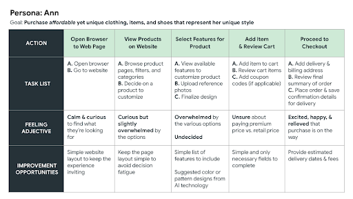
User Journey Map for Ann Byrne Persona
I approached the user journey map activity by focusing on the persona, Ann, and her goal to purchase affordable yet unique clothing online.
It is important to note that Ann wants to save time and money even while she shops for personalized items and clothing.
Define
Problem Statement
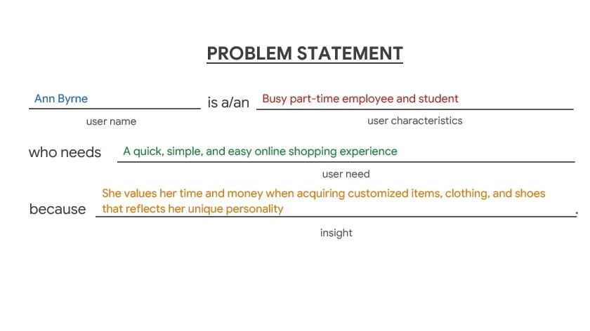
Problem Statement for the Ann Byrne Persona
From learning about the primary target audience and The Sweat Crew's competitors, a problem statement for the Ann Byrne persona outlines the user's characteristics, needs, and insight to guide the design and user experience for The Sweat Crew's shopping experience.
Site Mapping
Before I started drawing wireframes, I gathered and organized the website content.
I thought about the sections needed to showcase The Sweat Crew's products while reserving space for resources users may look for during their shopping experience.
Once I culled the essential categories and sections, I organized them for quick navigation across all screens (as seen below).
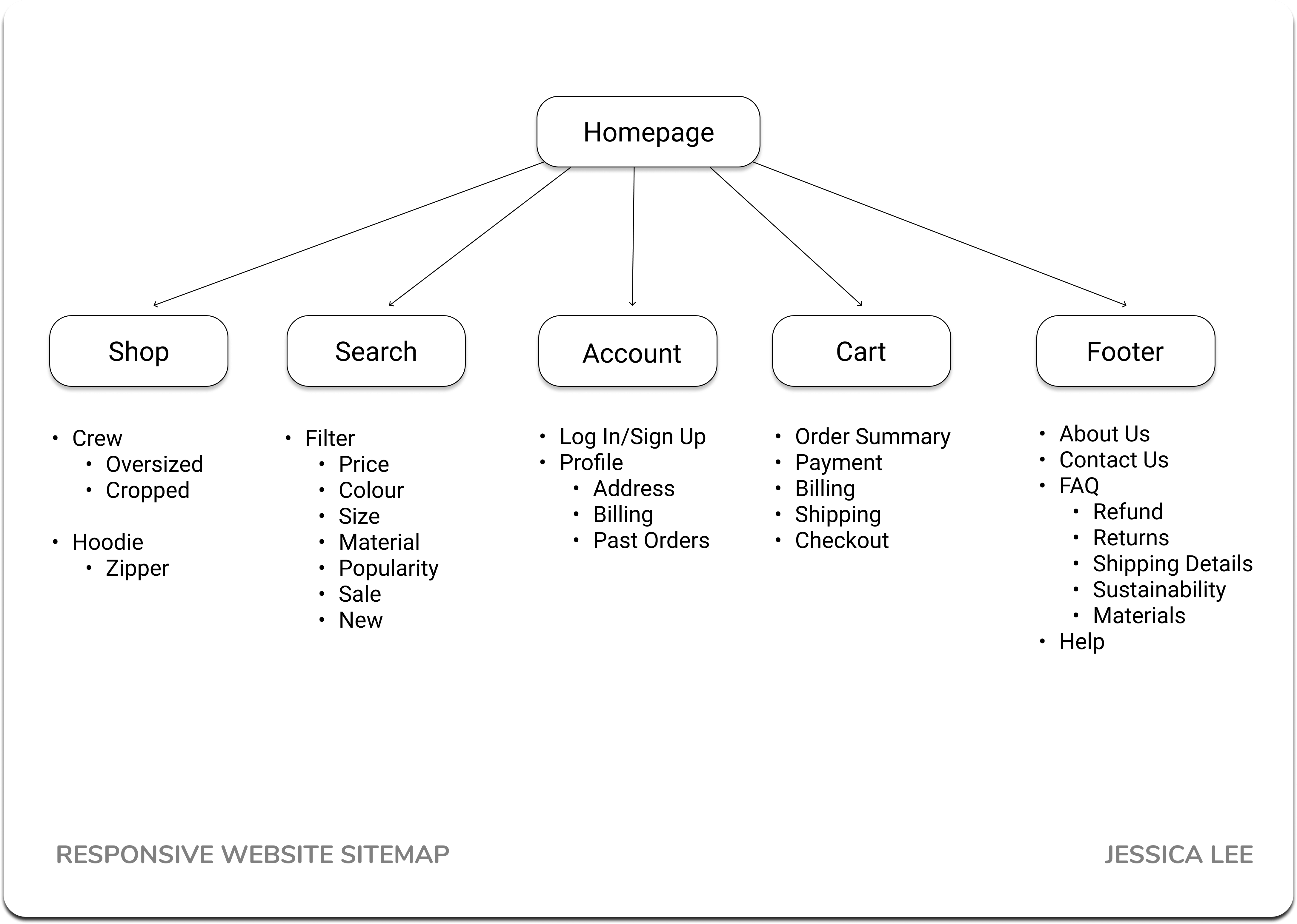
Website Sitemap for The Sweat Crew website
Ideate
Wireframing
With the sitemap in mind, I drew several variations of the homepage. I started by recalling that the persona, Ann, wants an efficient shopping experience.
Providing an efficient shopping experience means users want to navigate the website quickly and easily.
Having immediate access to a search button or bar, an account login, and an updated shopping cart may assist with quick navigation.
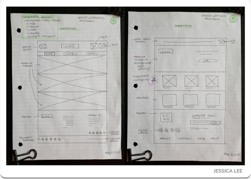
Pen & Paper Wireframe for Variations A and B for Homepage
Another approach to an efficient shopping experience is to display the products immediately.
In Variations A to E, I added additional image boxes to give users more opportunities to visualize the product (rather than only reading about it in the description).
In Variation F, I combined the most helpful components I sketched from Variation A to E.
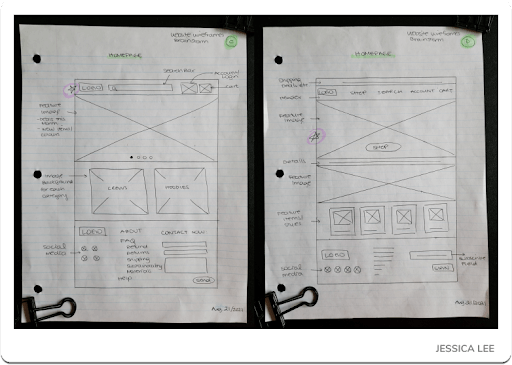
Pen & Paper Wireframe for Variations C and D for Homepage
Adding Accordions to the quick links above the footer extended the mobile experience as many of The Sweat Crew's competitors and popular clothing brands like Nike support their mobile visitors by having as much top‐down information available to help users meet their needs and reduce abandoned experiences.
Another benefit and priority is to reduce the amount of endless scrolling experience for mobile users as a common complaint I discovered from the initial interviews was the discomfort of gesturing the thumb continuously.
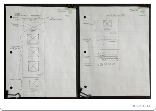
Pen & Paper Wireframe for Mobile Screen for Homepage
Prototype
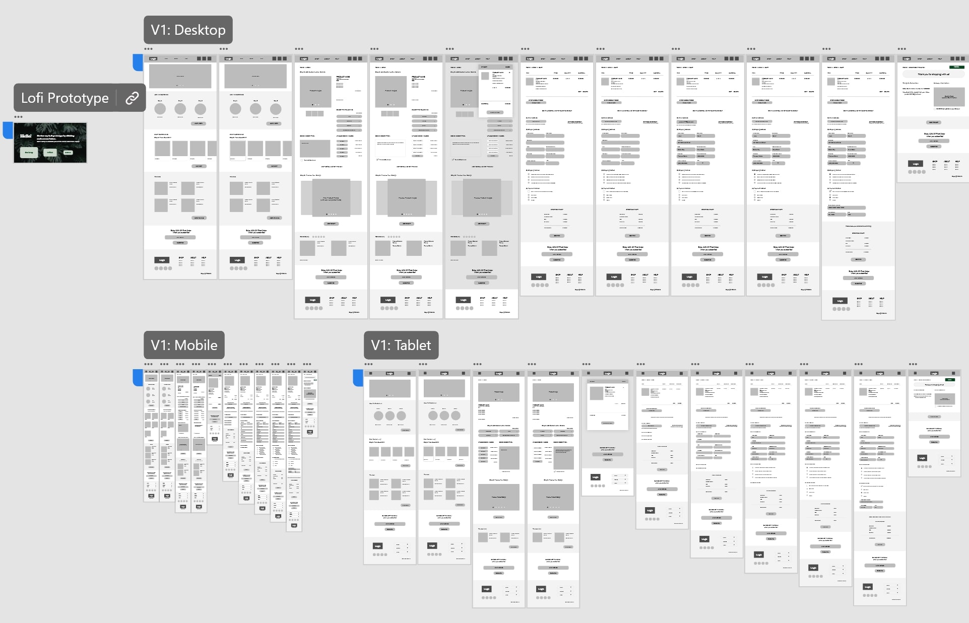
Screenshot of the wireframes for The Sweat Crew's Low‐fidelity Prototype
Through the Crazy Eights design activity, I finalized and translated the paper wireframes to digital low‐fidelity wireframes to begin prototyping the experience for the usability testing phase.
Explore the low‐fidelity prototype here first.
Style Guide
During the prototype stage, I gathered inspiration for The Sweat Crew's brand and created The Sweat Crew's colour palette by drawing inspiration from Pinterest.
I browsed and saved images to showcase sweatshirts and reflect the “mood” of the targeted audience would be interested in (based on user research).
With a board of images, I started sampling colors that would display a contrasting yet visually appealing fashion aesthetic to reflect the brand while maintaining interest from the users.
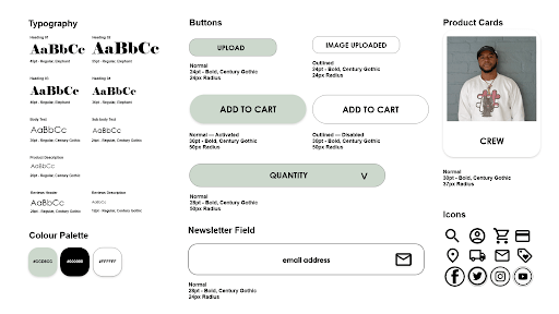
Style Guide, Style Tile (or Sticker Sheet) for The Sweat Crew
As seen in the images and high‐fidelity prototype, the pastel green tone (#CCD8CC) softens the black‐and‐white theme on every page.
Test & Iterate
Although the design appeared practical initially, I later learned I overlooked a problematic aspect — the navigation experience. Through a moderated usability study I planned and conducted, I learned from real users' feedback ways to improve the experience by making the interface more intuitive.
Before diving into the key findings of the study, let's keep the goals of the study in mind:
- Determine the useful and useless components
- Identify new, overlooked pain points
- Create a list of areas to modify for an interruption‐free shopping experience
After chatting with the participants, here are the key findings from the moderated usability study:
- The “How We Customize” section confused users (or wasn't simple to navigate the website).
- “Dissolve” transitions confused users about where the user is on the web page.
- Reviewing the updated visuals for the order would make it easier for users to follow along with the order process.
With the participants' feedback, I modified the original layout and design to resolve these pain points.
Here are two examples that significantly impact the user's shopping experience.
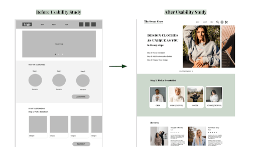
Homepage from Before and After Usability Study
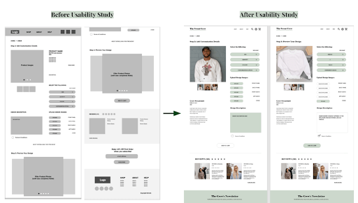
Customization Ordering Page from Before and After Usability Study
Reflecting on the Challenges
I realized the practice of ideating for various screen sizes and understanding how to make the transition between screen sizes fluid to appear “responsive” was the true challenge for me.
From this project and the repetition of creating each of the screens for this project's Minimum Viable Product (MVP) iteration, I learned further to empathize with the user from my reflections on each of the top three challenges below.
Challenge 1: Design a responsive website for multiple screens
One of the most frustrating parts about online shopping from mobile and tablet devices is the non-responsive web experience.
Spending more time with my pen & paper to sketch wireframes for all screen types taught me to consider enlarging or minimizing sections as the user's screens get smaller.
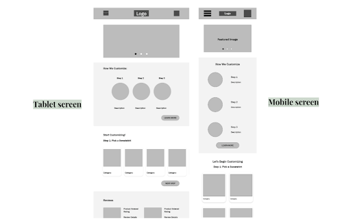
Digital Wireframe for Tablet and Mobile Screens of the Homepage
Challenge 2: Design a responsive website for multiple screens
Ordering customized items, clothing, and shoes is complicated when users need to provide design details and image references all in one place.
With a straightforward ordering process, the user can feel confident and at ease when shopping, creating a positive impression of the brand's attention to the user's shopping experience.
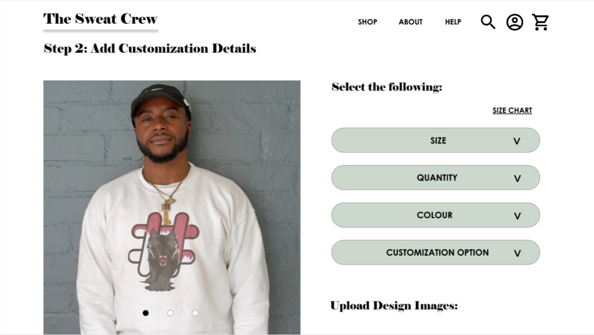
Customization Step 3, revealing the product design
Challenge 3: Easy to navigate for a positive first impression
The dominant feeling users had about the first version of the low‐fidelity prototype was confusion.
To provide users with a more confident shopping experience, some sections were removed from the Homepage to include the essential components users want and need to start their ordering process.
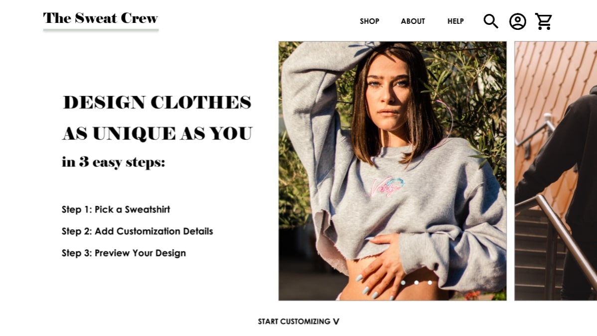
Homepage for The Sweat Crew's website
Check out the high‐fidelity prototype to view the changes.
Takeaways
One quote from user feedback:
“The Checkout pages are usually separate on other sites, which feels like a long journey. I like that [The Sweat Crew's checkout process] is on the same page!”
— Usability Study Participant
🌱 What I Learned
Researching, planning, and creating a user experience design for various screens require more time than developing one screen.
Although the content is relatively the same for desktop, tablet, and mobile experiences, I learned from the user feedback about how the components are organized impacts the user's satisfaction and first impressions of the product or service.
From speaking with usability study participants, I could iterate the design appropriately, effectively, and efficiently for the intended audience.
The Sweat Crew project taught me more about other components to consider when thinking about accessibility. I also learned more about information architecture when completing the site map.
In addition to wireframing and prototyping, the above lessons I've learned widened my perspective about more components to consider as a designer.
📌 Next Steps
With more time, I would like to add more details and make additional changes to improve the website to be more accessible to users. Here are the first 3 steps I would want to take:
- Add Alt Text: I add alternative text to my portfolio to make it easier for users with screen readers. With more time, I want to add alternative text to all the images on the website.
- Add More Animation: Having more animation or video clips of the products may appear more engaging and accessible on different screen sizes.
- Add Landmarks: Although the headings do help guide users, landmarks can further assist anyone who wants to use their keyboard more. This would be especially useful for the Step 2 Customization page.
🌿 Thank you for reviewing my work! If you have questions or would like to chat with me about my process, connect with me on LinkedIn! I look forward to learning from your thoughts and feedback. 🥳