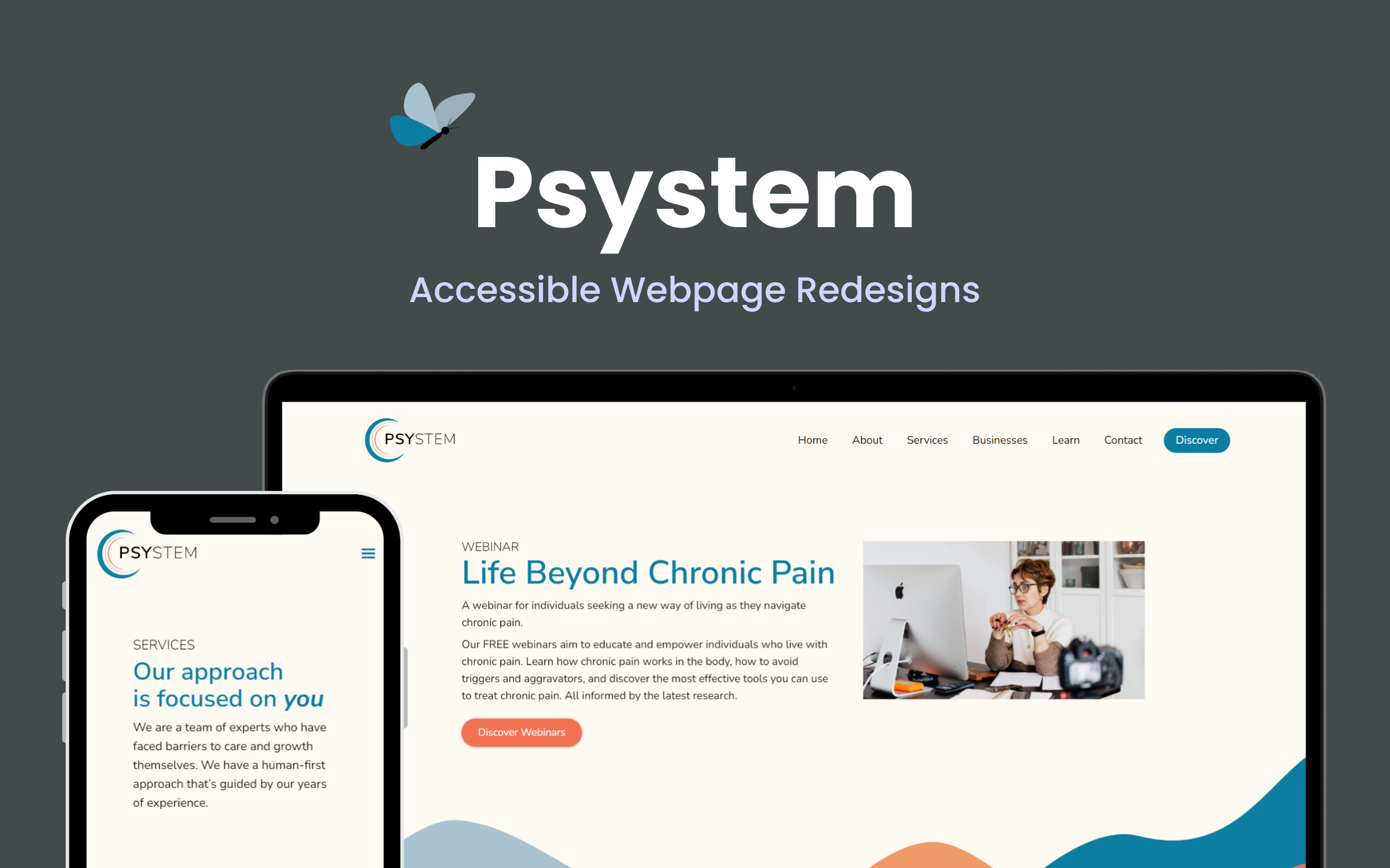
Landing Page Optimization
Improving Accessibility & Boosting Website Visits by 33%
The Challenge
Psystem, a health and wellness coaching organization for chronic pain, needed a website redesign to support an upcoming campaign.
My audit identified ways to improve mobile usability and increase signups by refining navigation, readability, and layout to reduce cognitive overload.
Approach
I led the UX strategy and implementation, enhancing accessibility, responsiveness, and user flows to drive engagement and conversions.
Problem
How might we make information more accessible and mobile–friendly so that users can easily find and sign up for Psystem's services without feeling overwhelmed?
Understanding User Needs
Through user research, stakeholder discussions, and competitor audits, I identified key areas for improvement:
- Simplified Content Structure — Users preferred dedicated pages for each service to enhance clarity.
- Consistent Typography — A unified font style improved trust and readability.
- Intuitive Navigation — Users wanted quicker access to key resources.
- Scannable Content — Improved readability on desktop and mobile screens.
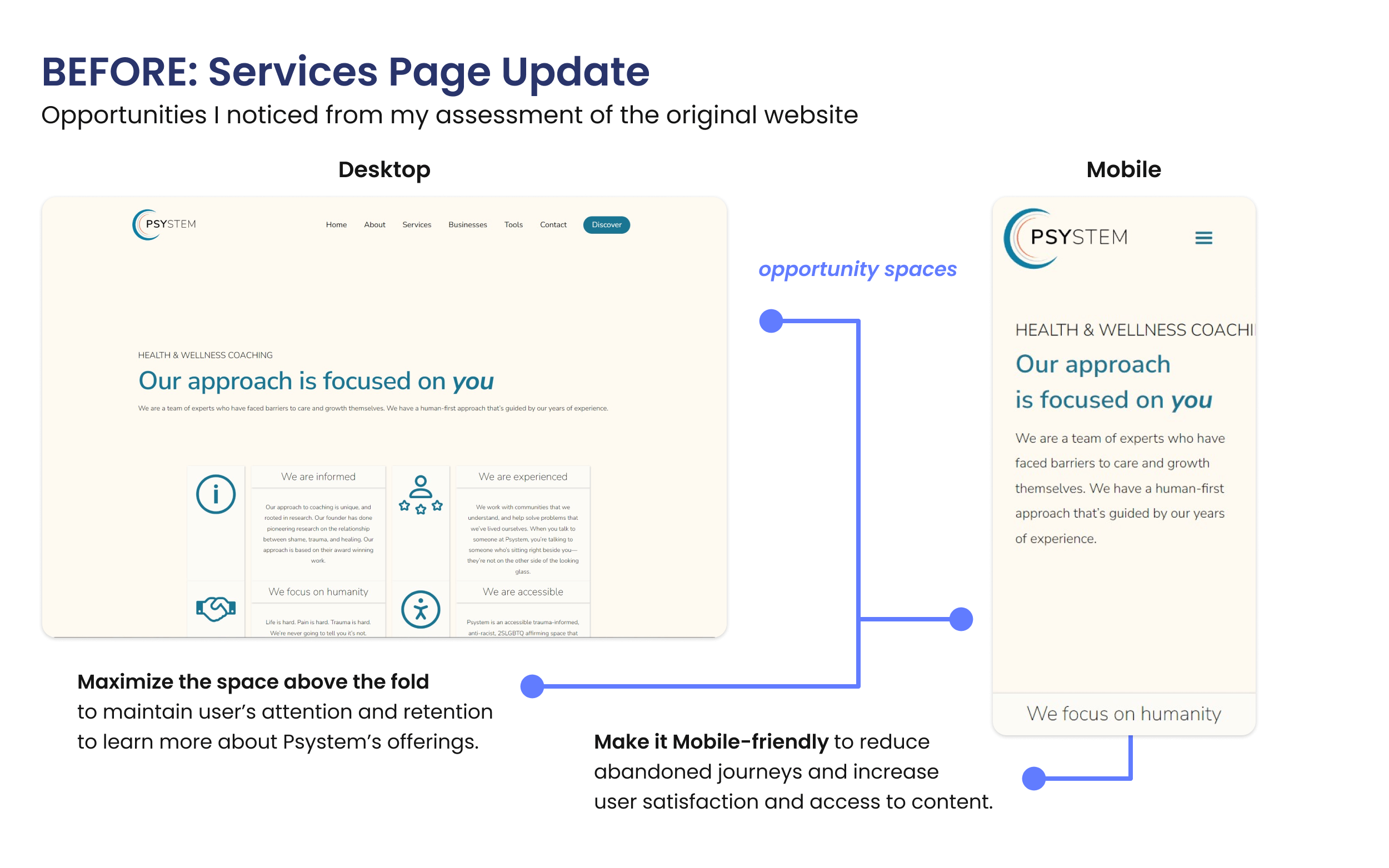
The Before appearance of the Services page on Desktop and Mobile screens with highlights for opportunity spaces.
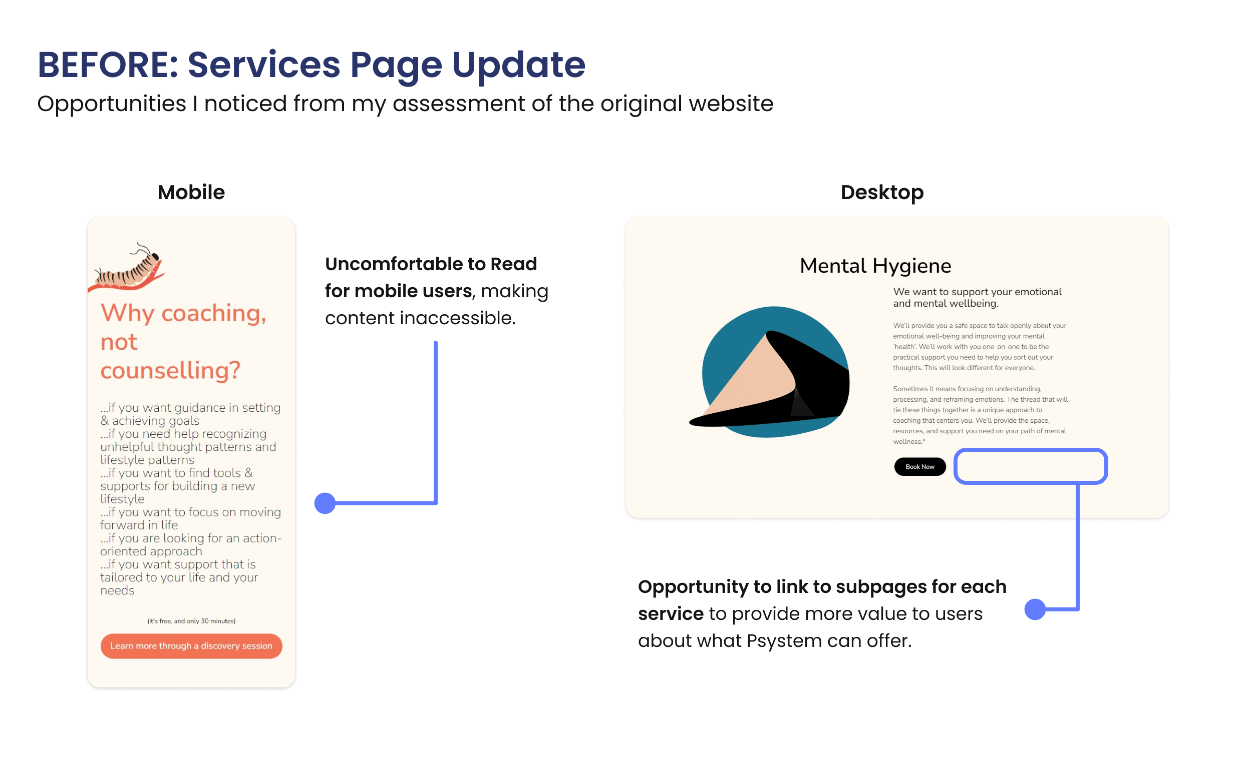
The Before appearance of the typography and call‐to‐action buttons on the Services page in Desktop and Mobile screen views.
Enhancing Accessibility & Responsiveness
Using “How Might We” statements, I designed solutions aligned with WCAG standards to make the site more intuitive:
- Mobile‐Friendliness & Restructured service pages for clarity, starting with smaller viewports.
- Webinar Signups & Simplifying registration flow to improve access to event details.
- Universal Access & Optimized the design for tablet and desktop users to ensure a seamless transition between viewports.
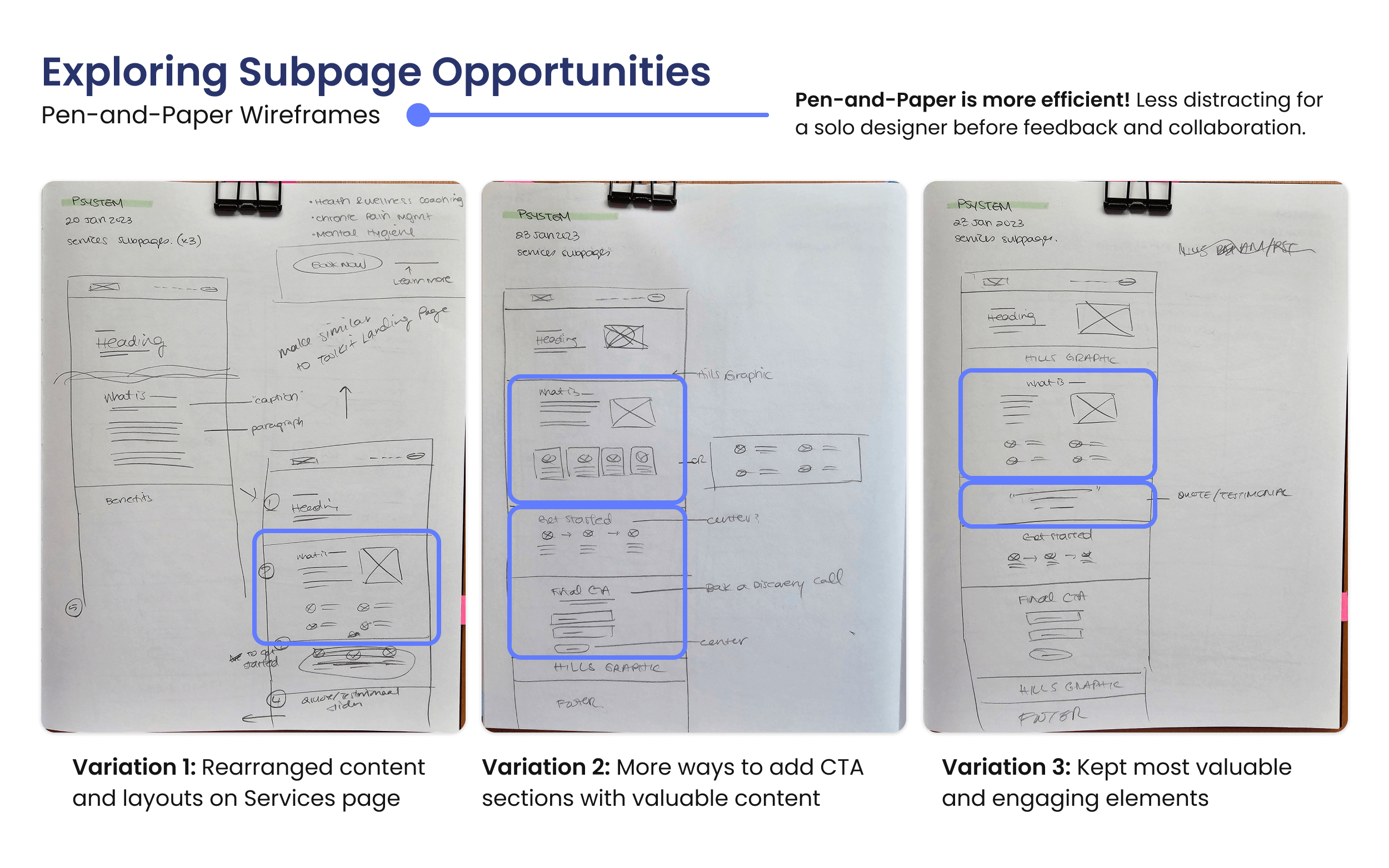
Pen‐and‐paper wireframes during the ideation phase for the Services Subpages to explore the options in providing value to the users.
Refining Through Feedback
After stakeholder and user testing, I made critical refinements to the following:
- Improved Negative Space & Added breathing room for easier reading.
- Restructured Visual Hierarchy & Prioritized the most relevant content first.
- Enhanced Call–to–Action Visibility & Increased contrast on signup buttons.
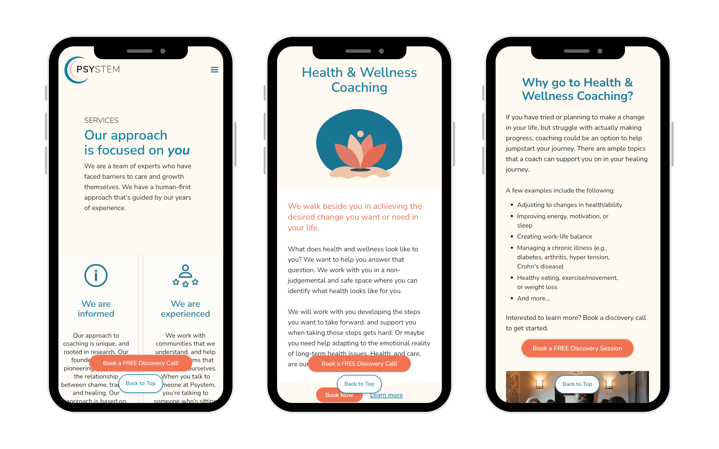
- Added “Back to Top” Button & Reduced scrolling fatigue for mobile users and improved content accessibility.
Improved Negative Space
The Discovery page's “Why Psystem” section was improved by adding more “breathing room” or padding to improve content engagement.
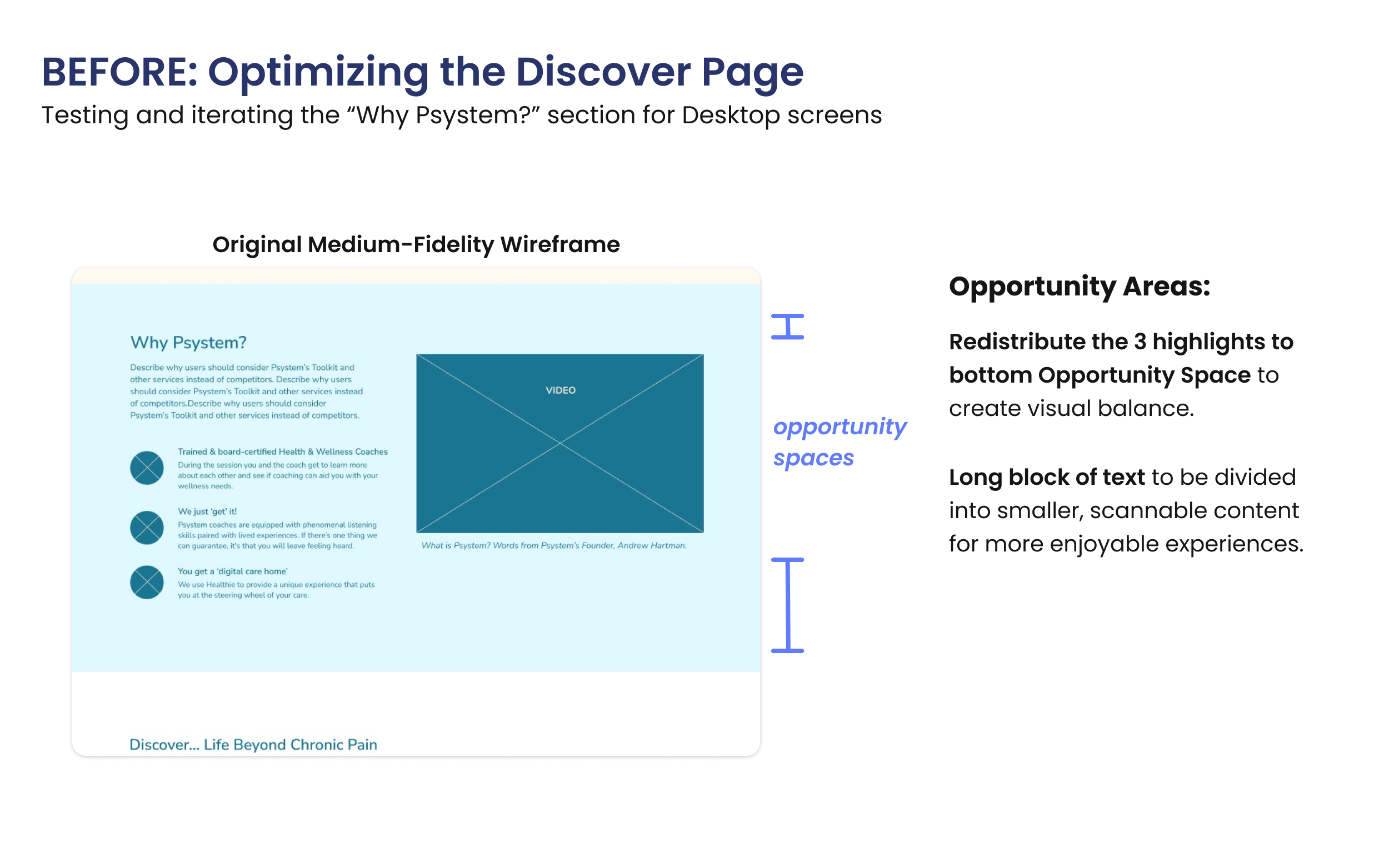
The Before of the “Why Psystem” section in the Desktop view on the Discover page.
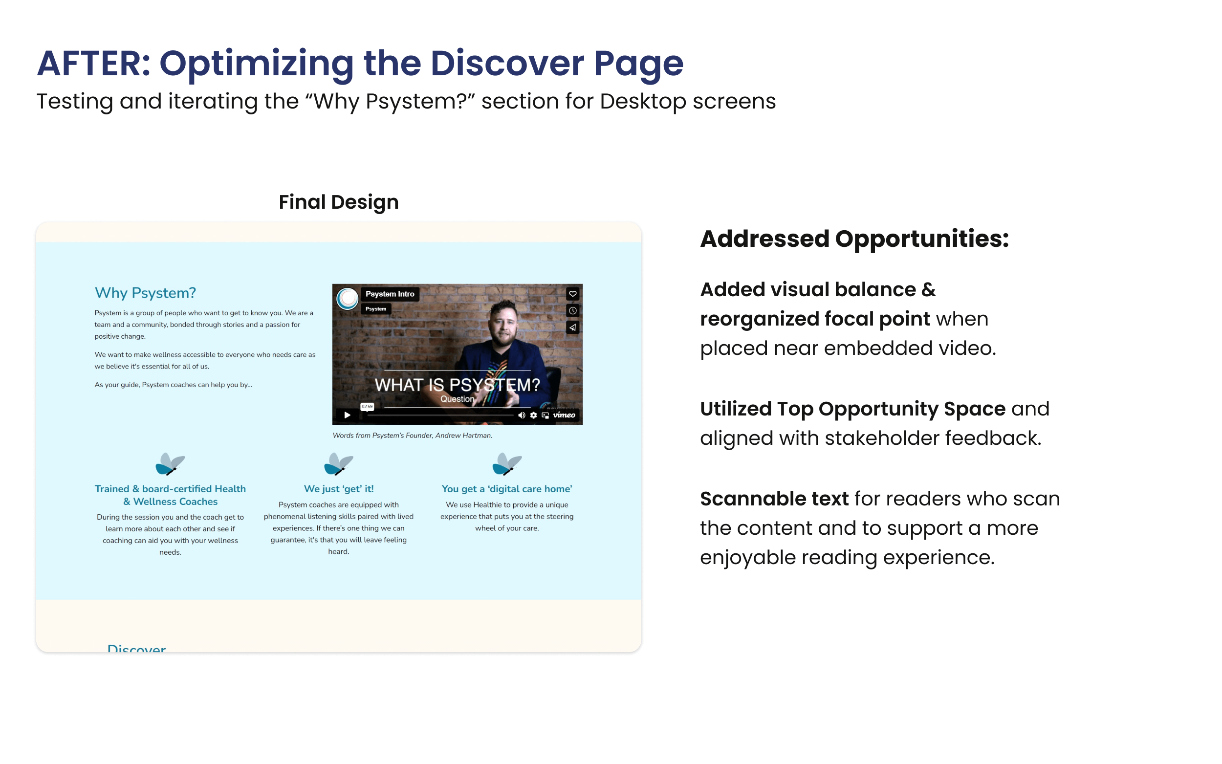
The After of the “Why Psystem” section in the Desktop view on the Discover page.
Restructured Visual Hierarchy
Prioritizing the most relevant webinar session by allocating more space for it made it easier for users to notice and sign up for Webinar events.
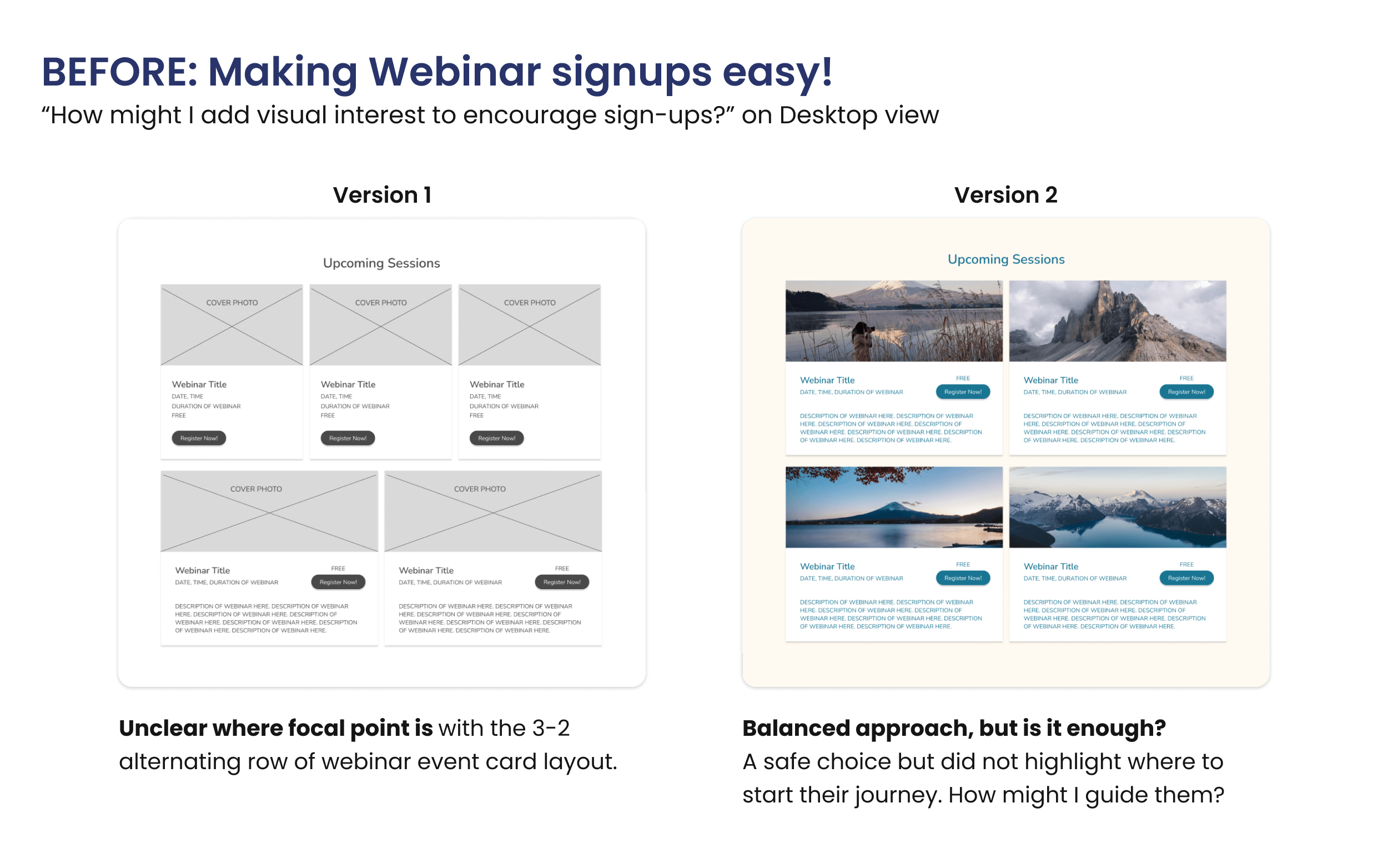
First two iterations of the Upcoming Webinar Sessions section layout to brainstorm how to generate interest while informing users of upcoming events.
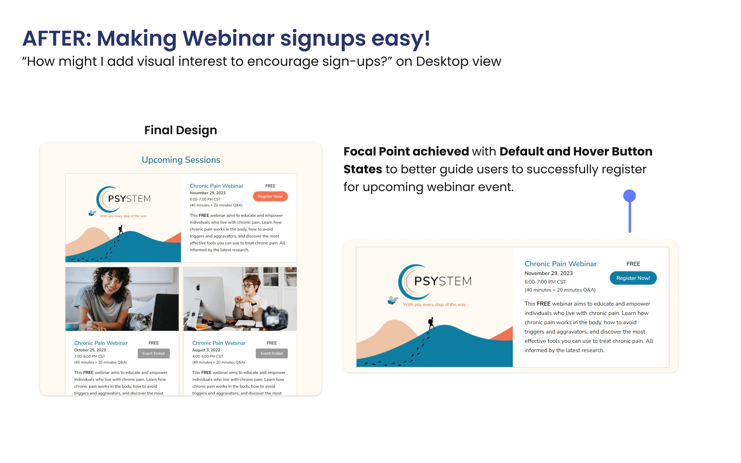
Final design of the Upcoming Webinar Sessions section with more contrast on the Call‐to‐Action button in Default and Hover states to register for the upcoming event.
Enhanced Visibility with a Tertiary Colour
Introducing the tertiary colour Ocean Bay added visual interest to improve content accessibility and engagement while complementing the colour harmony of Psystem's calm tone.
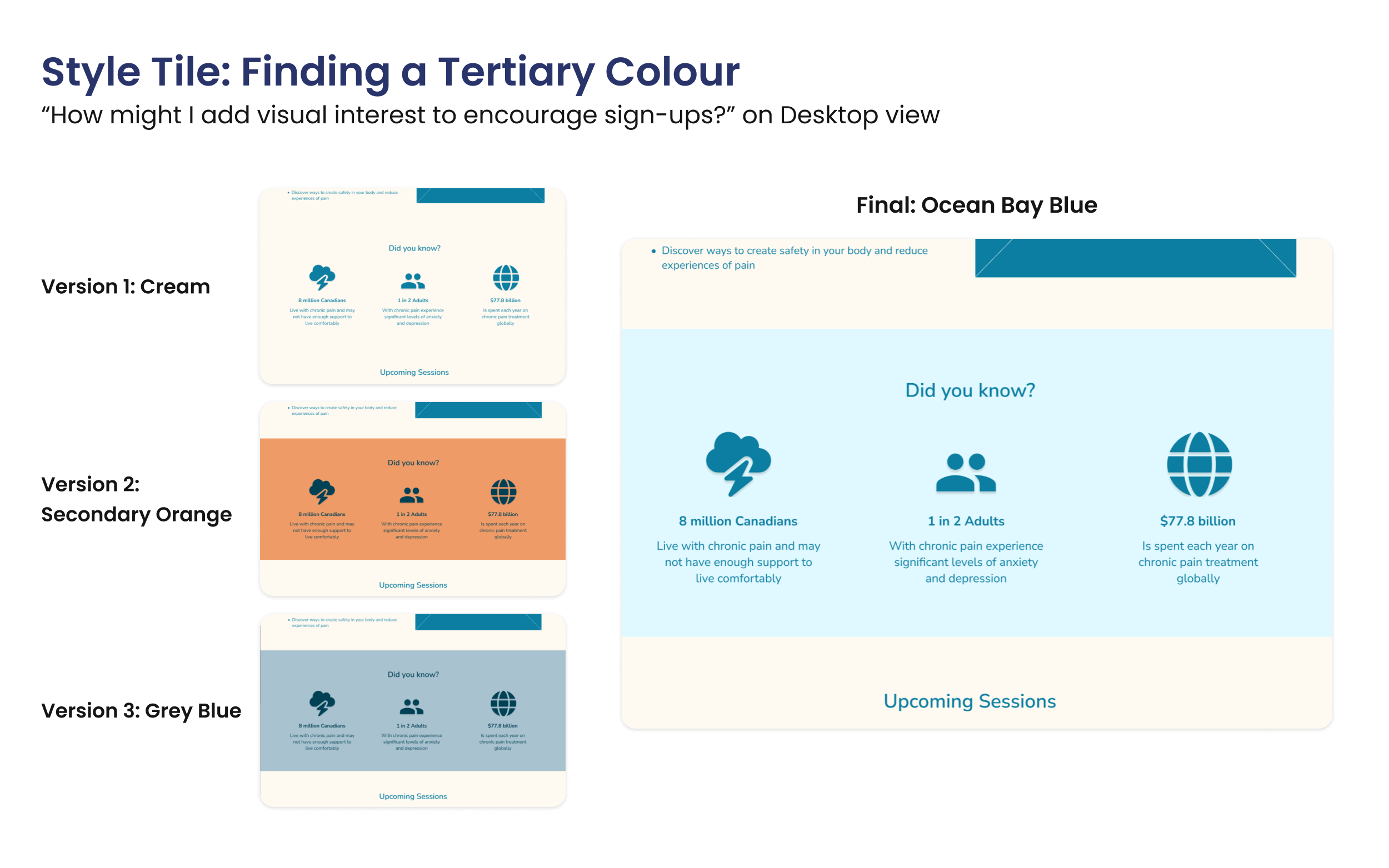
Three significant trials with existing brand colours before finding the right blue hue to highlight important content while complementing Psystem's colour palette.
Added “Back to Top” button for Accessibility
I added a “Back to Top” button to address thumb fatigue from scrolling through content on mobile experiences.
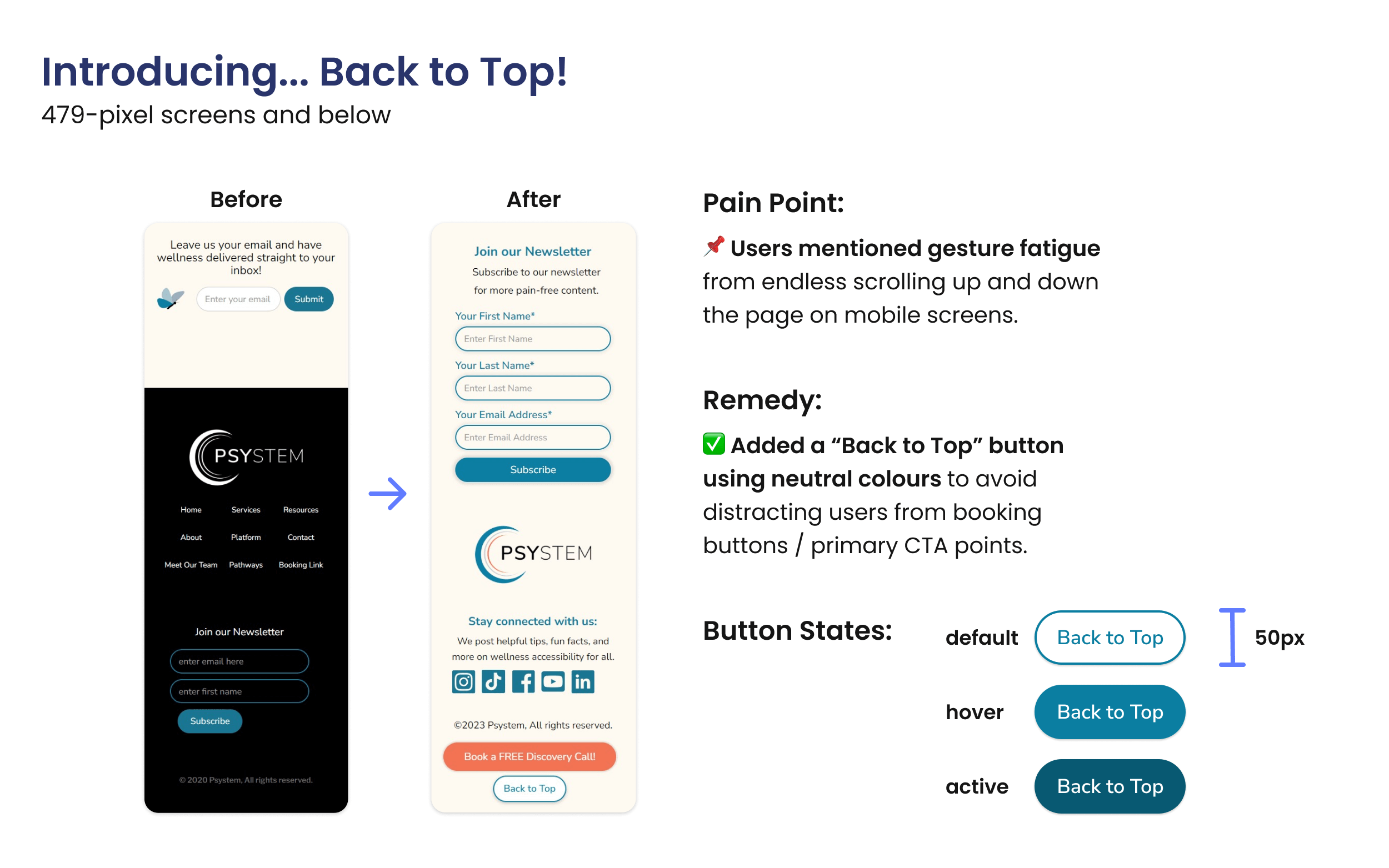
The Before and After of the mobile screen size showcases the difference of having a Back to Top button to make the user's experience more enjoyable and accessible.
Responsive Designs to Increase Signups
✅ Optimized 5 mobile–friendly pages, increasing visits by 33%
✅ Boosted newsletter and webinar signups within 2 weeks of launch
✅ Received positive stakeholder feedback on usability and accessibility
Streamlined Information
Unified Psystem's Services on one page.
Mobile screens showcasing the consistent, responsive interface while informing users of Psystem's services.
Clear Signups
Simplified Webinar registration and newsletter signup with clear call–to–action buttons.
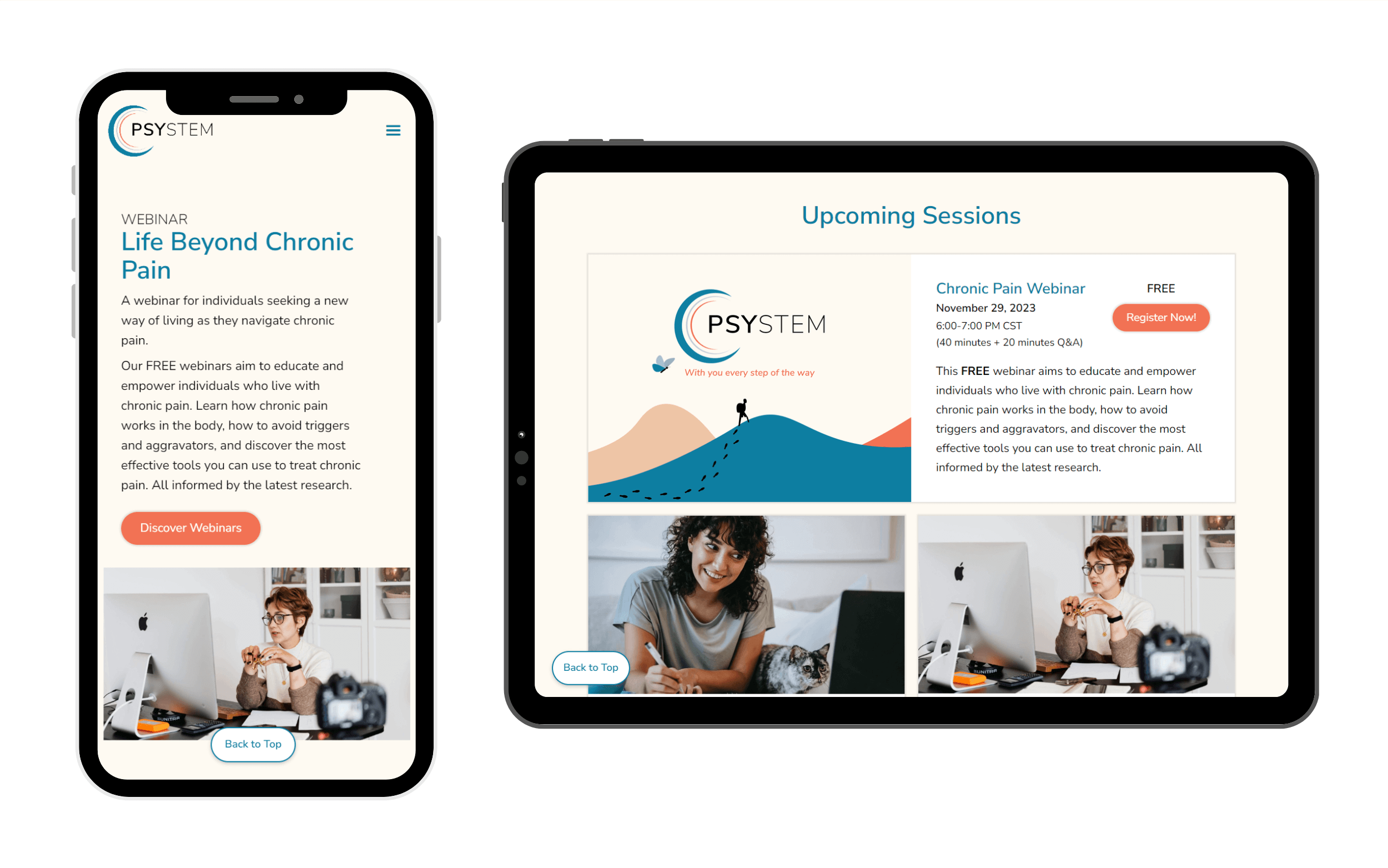
Mobile screenshot of Webinar page's hero section and tablet screenshot of Upcoming Webinar Sessions section to register for.
Accessible Shortcuts
Updated responsive navigation for quick resource access across the website.
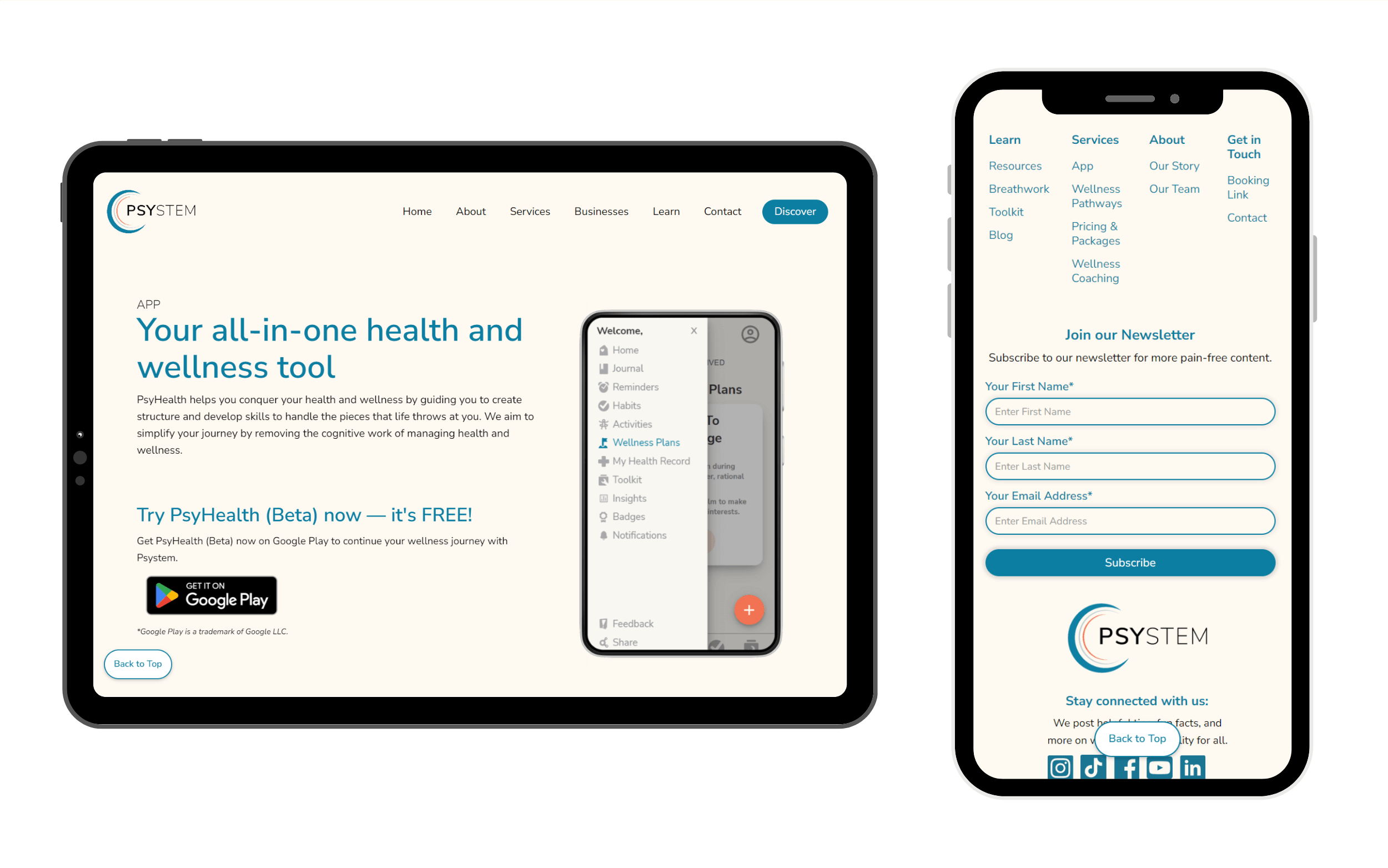
Tablet screenshot of the PsyHealth App page's hero section and mobile screenshot of global footer navigation.
Key Takeaways
From research to deployment, I learned ways to refine my problem–solving approach:
- Adaptability — Delivered impactful UX improvements within constraints.
- Early Stakeholder Collaboration — Drove informed design decisions.
- Continuous Optimization — Set up Key Performance Indicators (KPI) & Cascading Stylesheet (CSS) refinements for future iterations.
Next Steps
To support future website updates with an expanded team, I would prioritize the following next steps:
- Track KPIs to refine conversion strategies.
- Updating other pages to align with current user needs and expectations for a cohesive experience.
- Optimize CSS Styles for seamless developer handoff as the website scales.