Subscription Flow Creation
Boosted User Satisfaction by 14.2% with Intuitive Payment Design
Discovering the Starting Point
The final step for PsyHealth's Minimum Viable Product (MVP), was establishing a sustainable revenue stream through a subscription plan.
To ensure scalability for future course payments, I researched cost–effective payment integrations compatible with PsyHealth's current tech stack.
Problem
How might we introduce a premium subscription plan and prepare for courses purchases so that users can trust the payment process to complete subscription transactions?
Managing the Project
I I collaborated closely with the Project Manager and Back–end Developer to execute within project constraints by addressing:
- Payment data handling
- Platform integration
- Design limitations within the MVP phase
Defining the Payment Journey
To introduce the Premium Subscription seamlessly, I outlined the steps before and after the payment process, identifying affected pages to create a smooth transition.
Benchmarking Industry Standards
Analyzing the top 5 competitors helped identify best practices and user expectations, ensuring alignment with industry standards to build user trust.
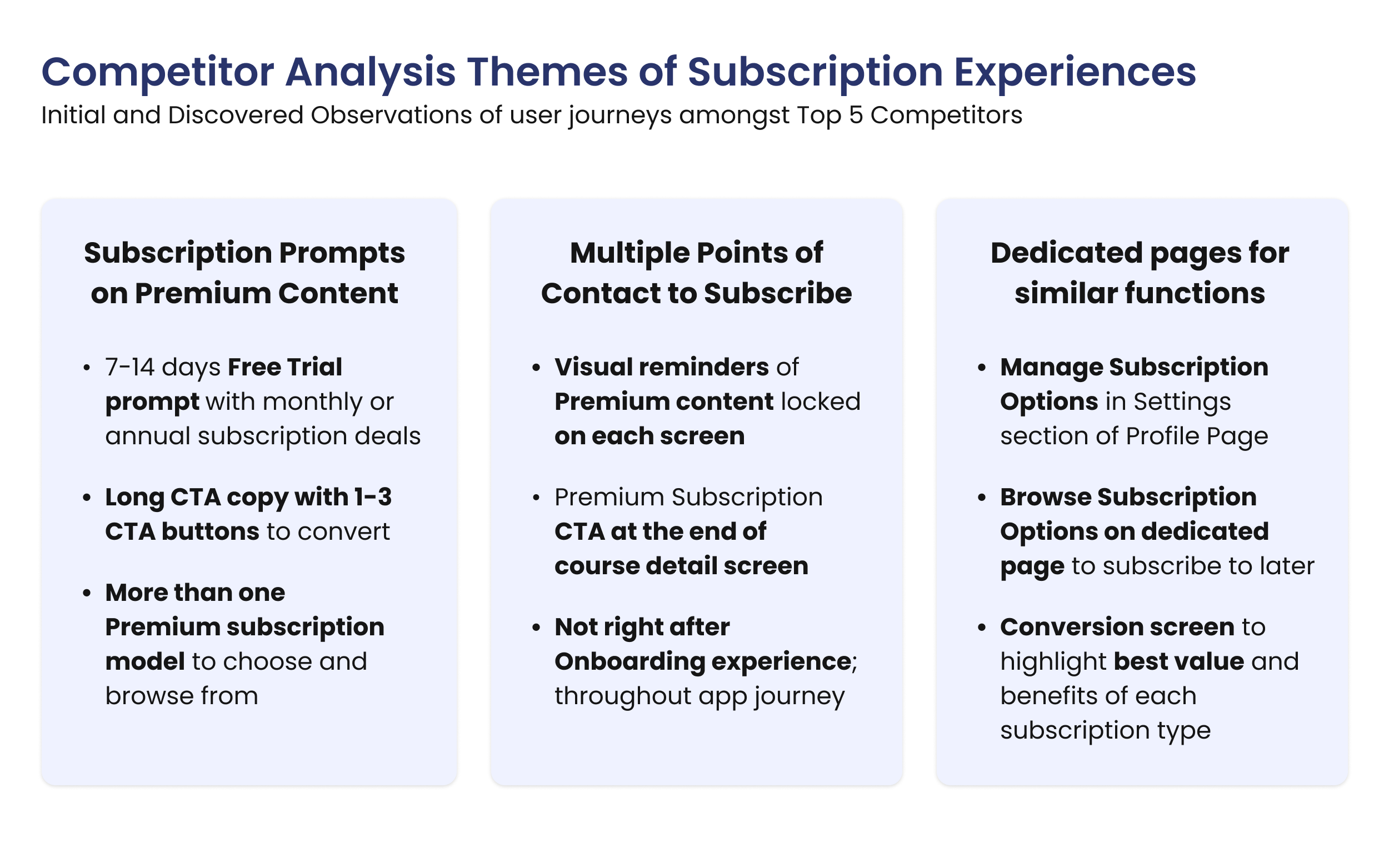
Competitor Analysis Themes from initial and discovered observations of user journeys amongst Top 5 Competitors.
Streamlining Payment Design
From speaking with users, I confirmed opportunities to refine the payment flow for a more intuitive experience that minimized friction.
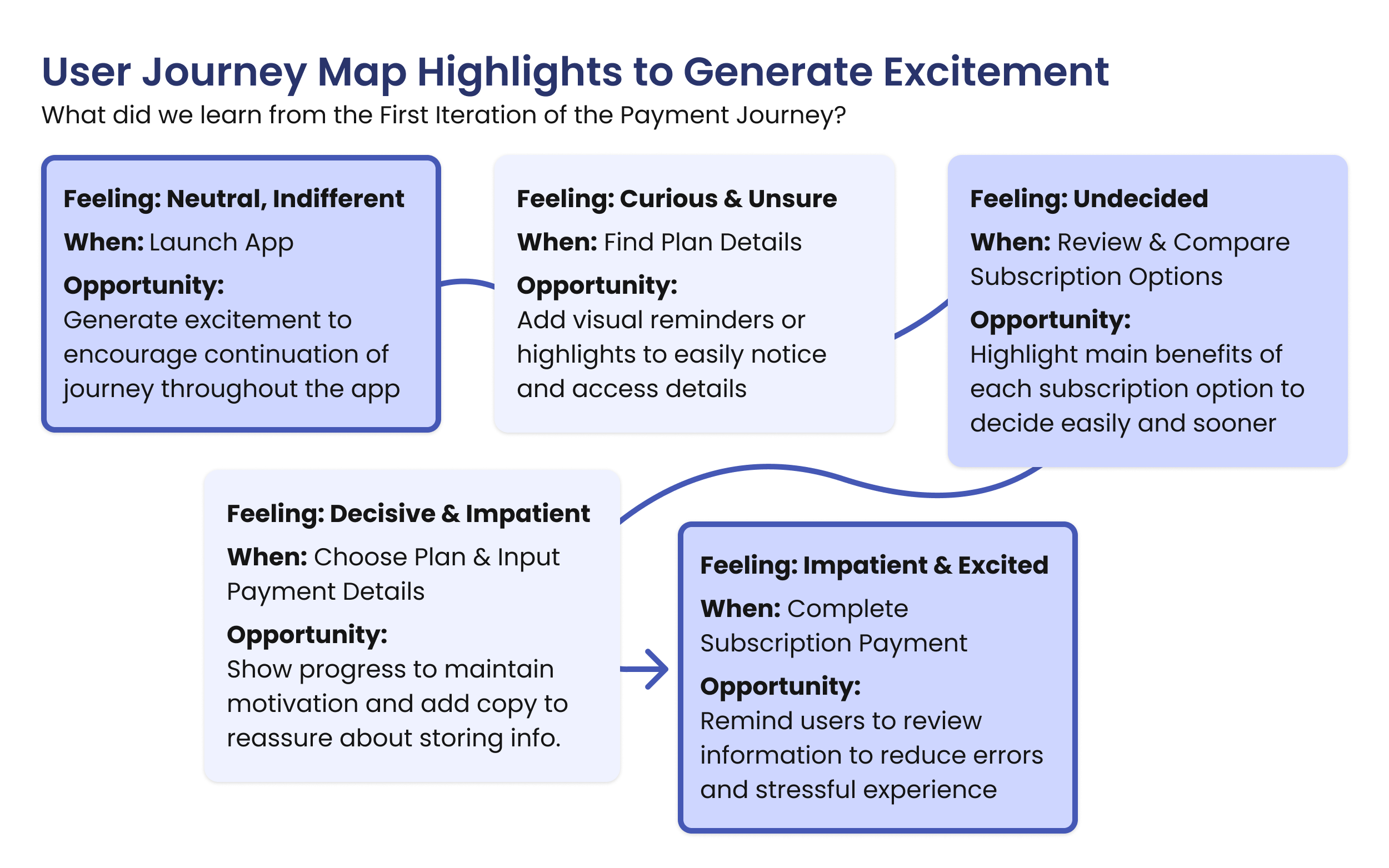
Highlights from the User Journey Map, focusing on how users felt throughout the process and opportunity areas to iterate on in the design.
Key Insight
Users expected subscription management details to be in one place.
To align with expectations, I merged Profile and Settings into an all–in–one management screen for a seamless experience.
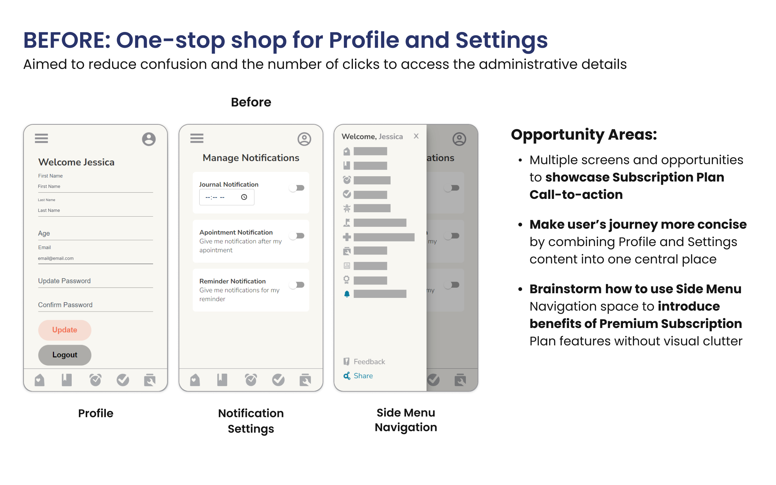
Multiple screens to review and update profile and settings details with a Call–to–action box added to the Side Menu Navigation to encourage upgrading to Premium.
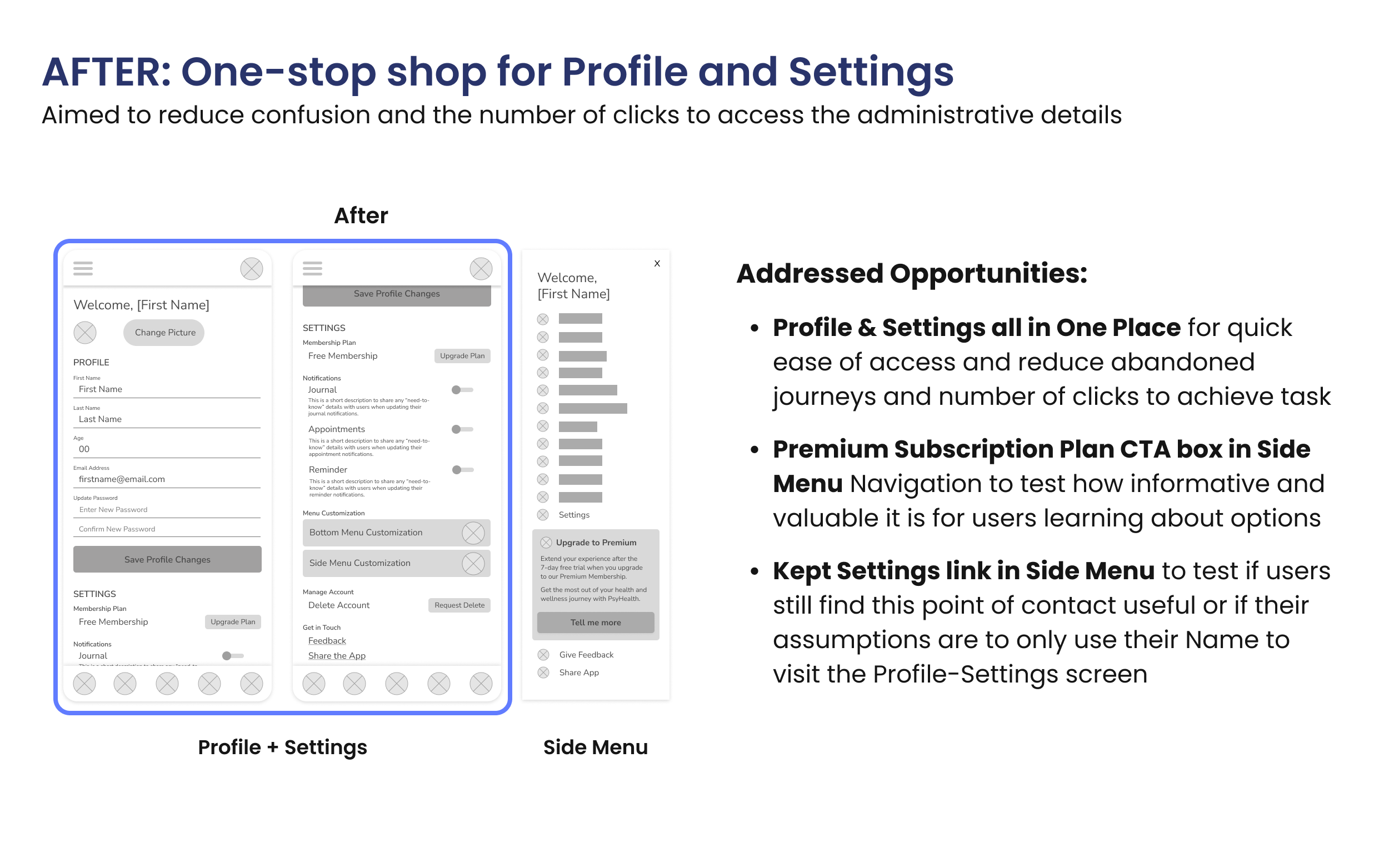
One screen for users to review and update profile and settings details with a Call–to–action box added to the Side Menu Navigation to encourage upgrading to Premium.
Enhancing User Confidence & Trust
Differentiating Subscription Types
I conducted A/B testing to optimize the Monthly vs. Annual selection, ensuring benefits were visually accessible for confident decision–making.
The redesigned comparison screens improved clarity and engagement of the subscription options.
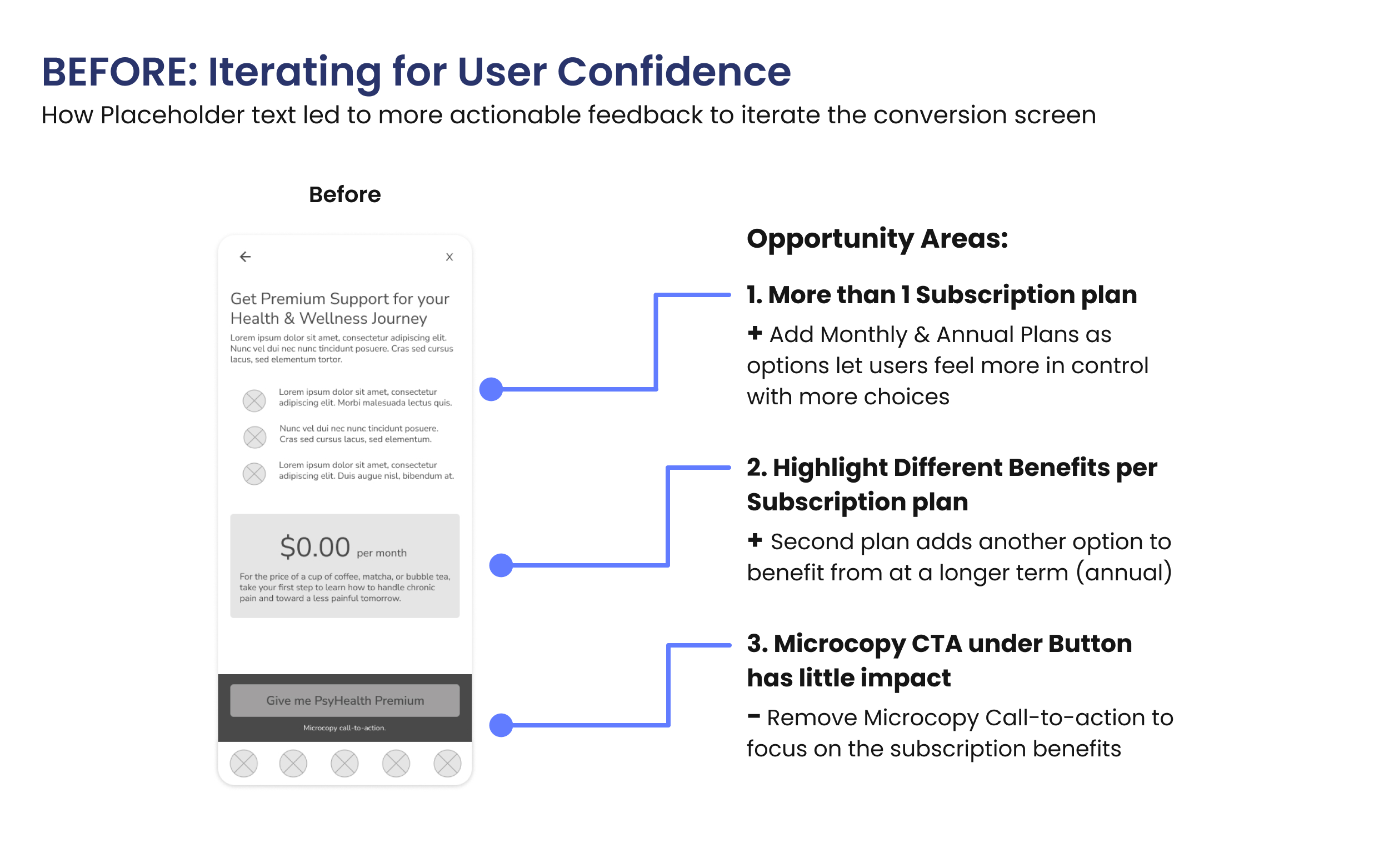
The Before wireframes of PsyHealth's Subscription‐Payment Call–to–action screen.
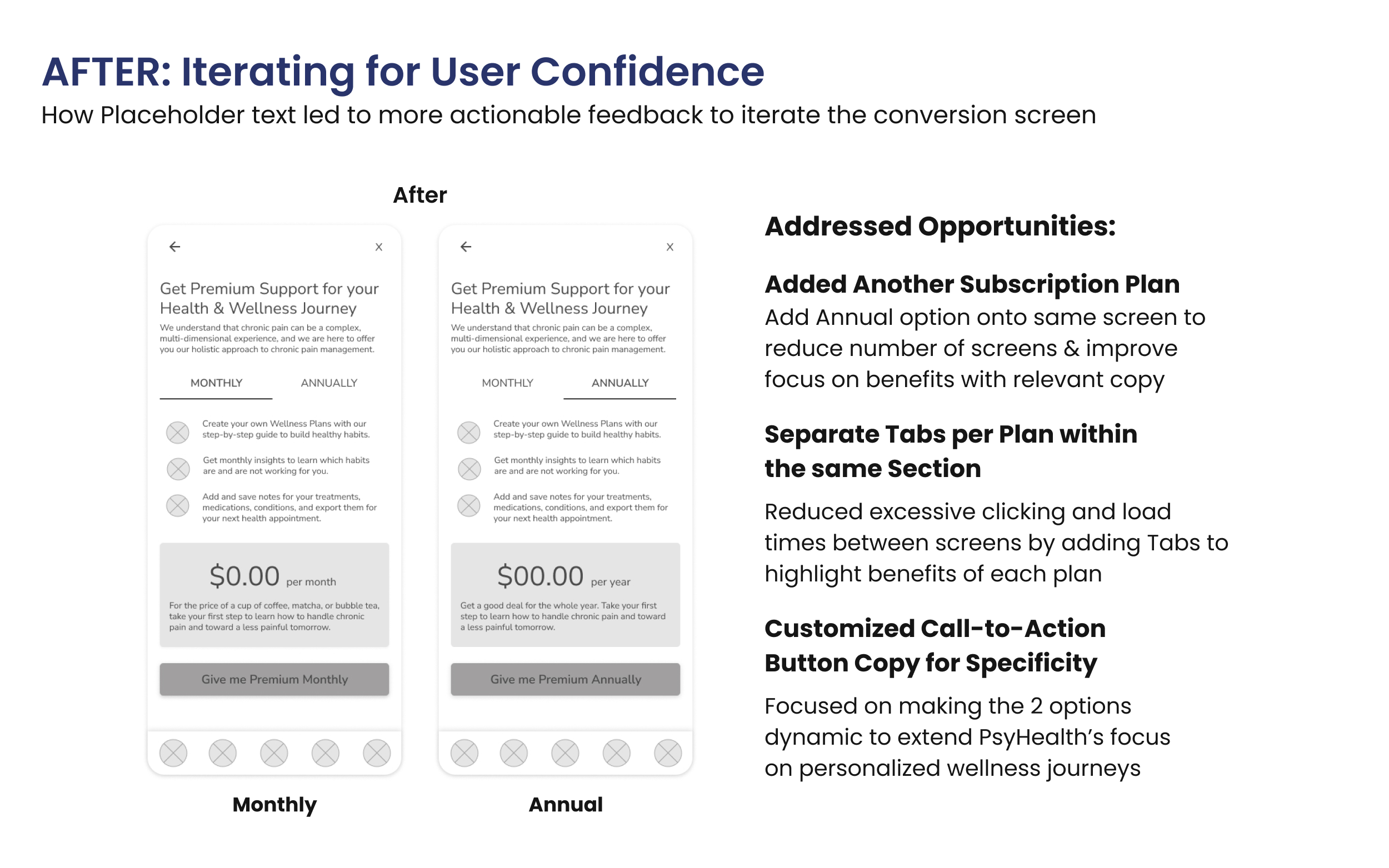
The After wireframes of PsyHealth's Subscription‐Payment Call–to–action screen.
Creating Modals for Engagement
To highlight freemium limitations and Premium benefits, I designed the placement, copy tone, and layout of contextual modals based on expert feedback for clarity.
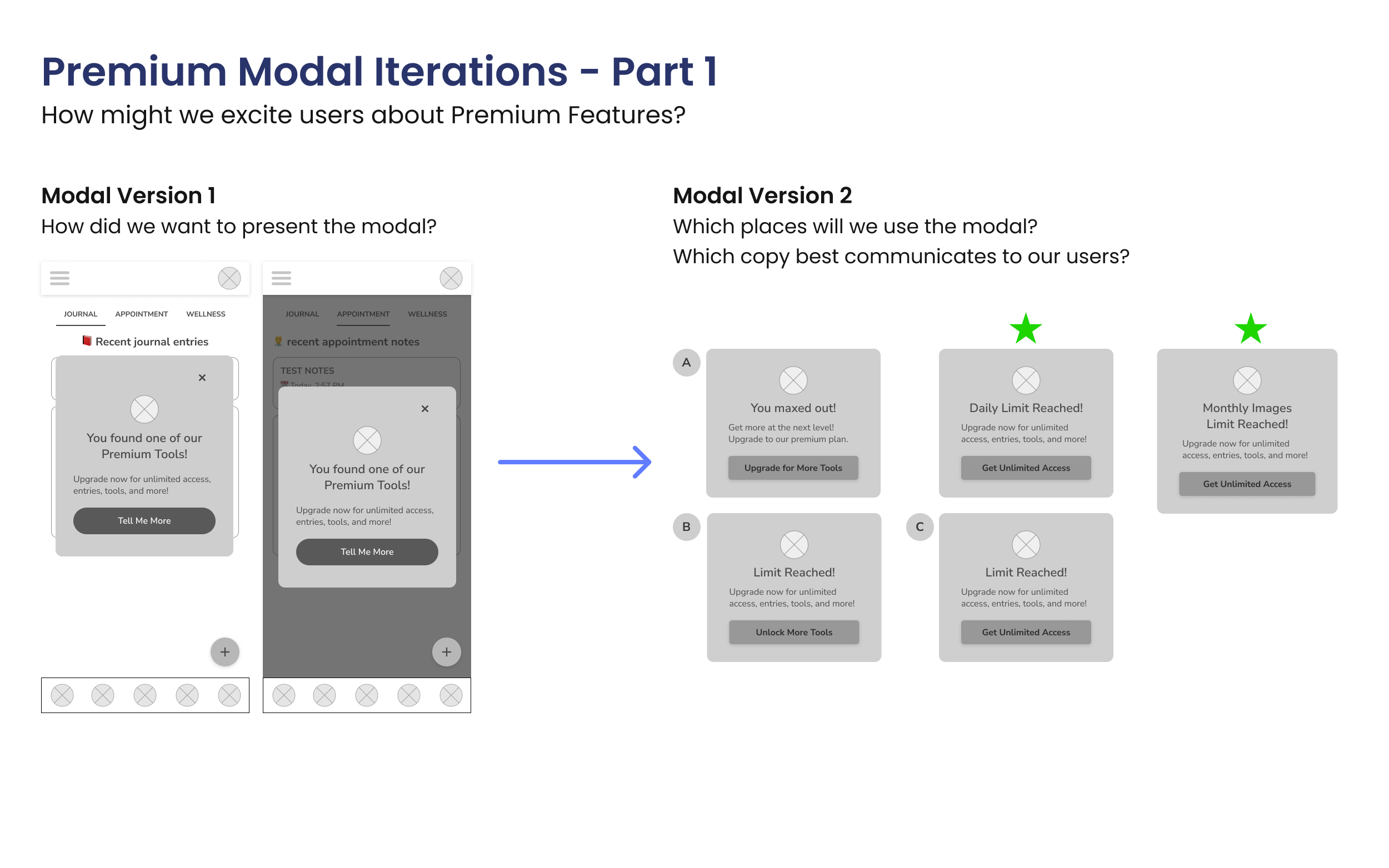
Starting with layout then iterating the copy to use a friendly tone to generate interest and excitement in premium features.
Enhancing Visual Identity
I used Tangerine buttons for action–driving contrast and randomized emojis to create a fresh, engaging experience.
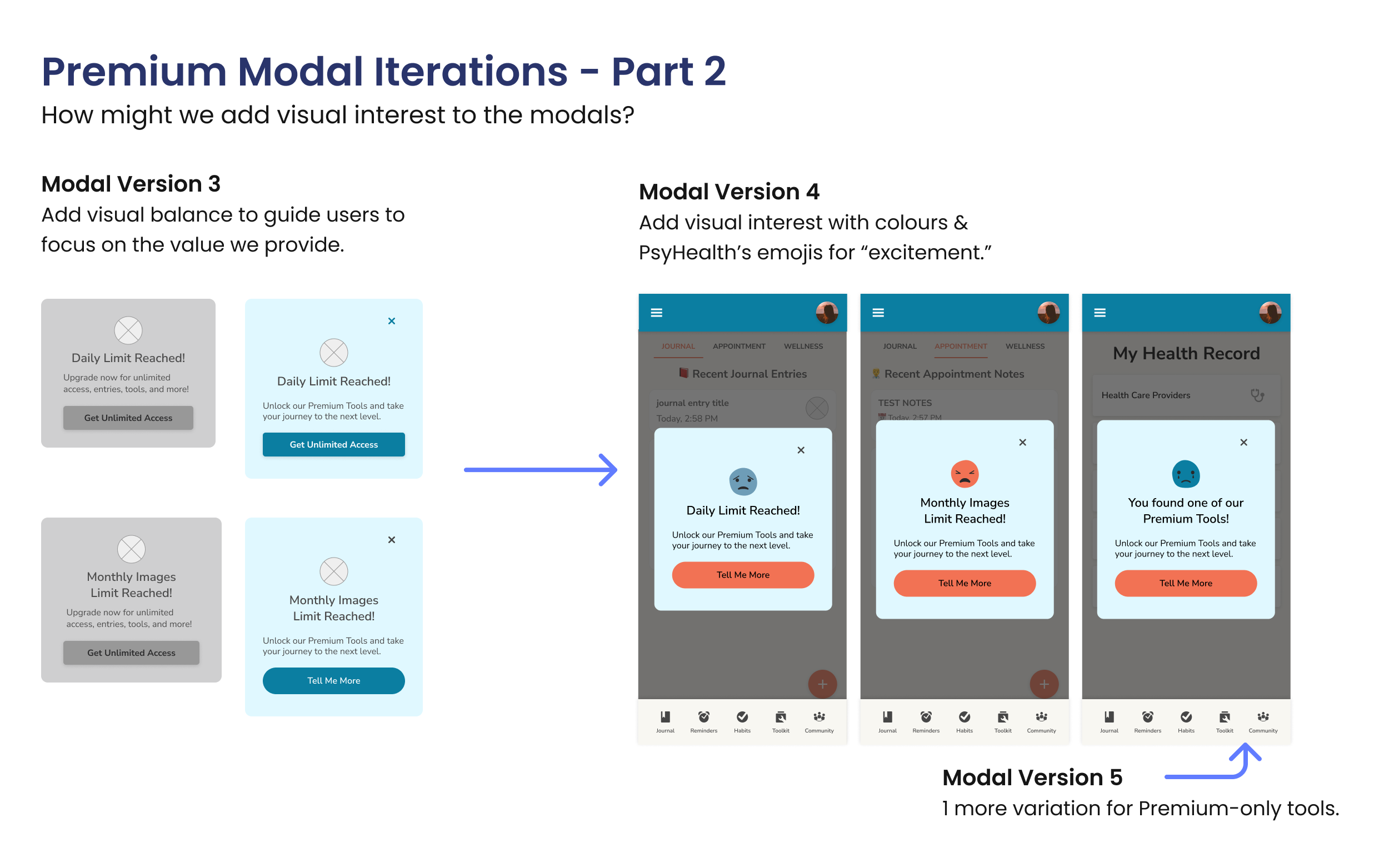
Progression of Modal iterations, showcasing PsyHealth's visual identity through border–radius and the use of emoticons.
Strengthening Brand Trust
Inspired by PsyHealth's tagline, “With you every step of the way”, I advocated for the following design choices to elevate the experience:
- Added a Dynamic CTA Box in the Side Navigation for easy Premium access.
- Enhanced payment success and error pages with branded emoticons to extend emotional support beyond transactions.
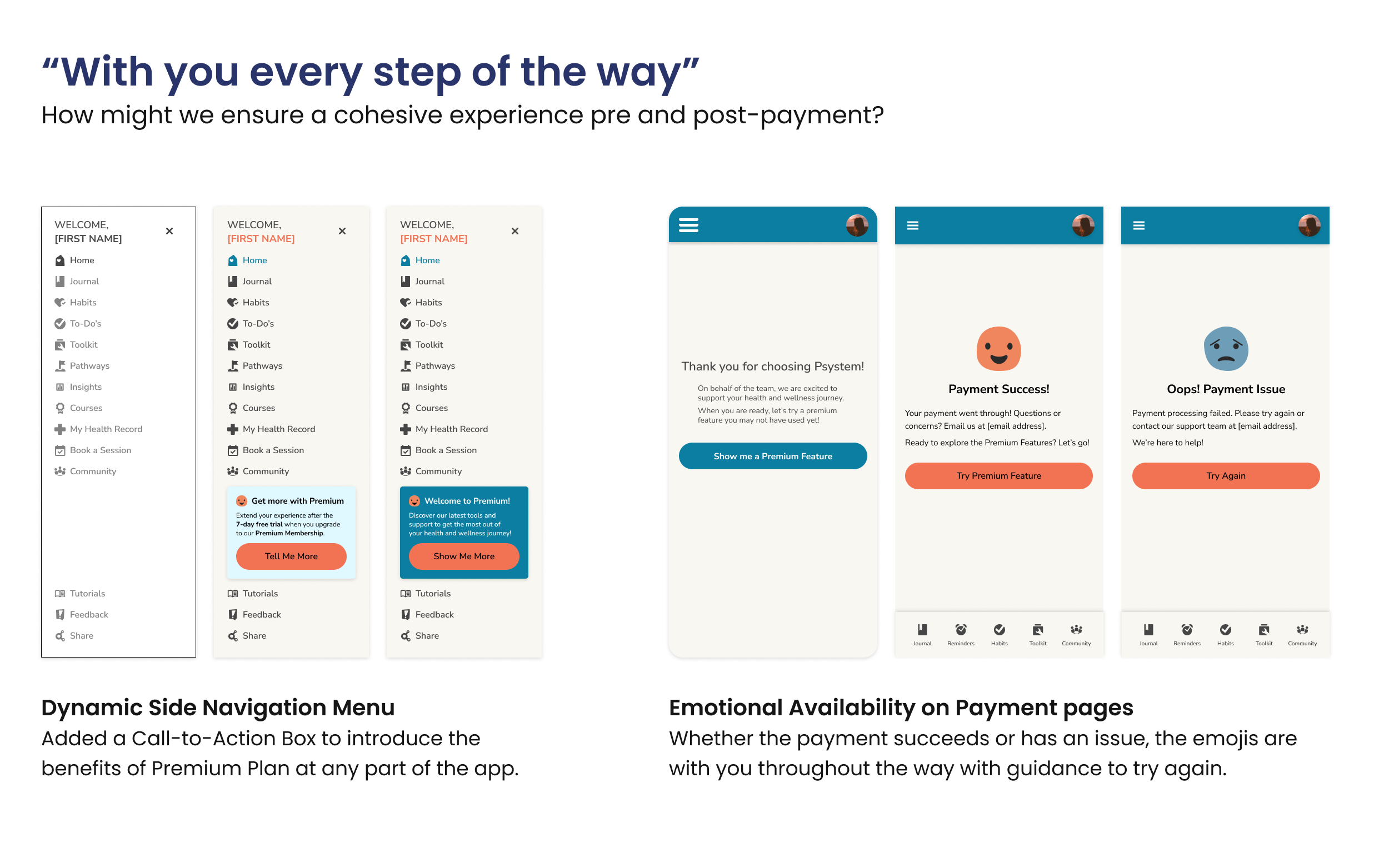
Iterations of Side Navigation Menu and Payment Success and Error screens.
Building Trust through Design
✅ Developed a seamless subscription‐payment journey and optimized Profile settings for efficient subscription management.
✅ User–validated improvements:
“I like that everything is on one page or screen for the profile and settings sections. It's quicker to manage subscriptions and payment details where I expect them to be.”
— Usability Study Participant
✅ Branding consistency strengthened through:
- Intentional colour use
- Branded emoticons
- Enhanced visual engagement
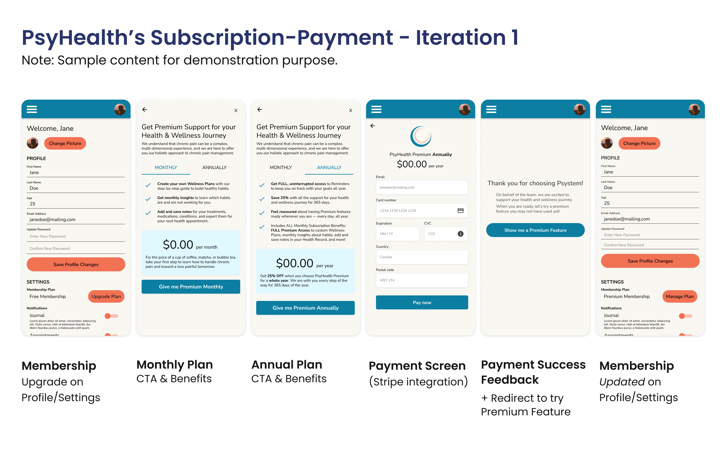
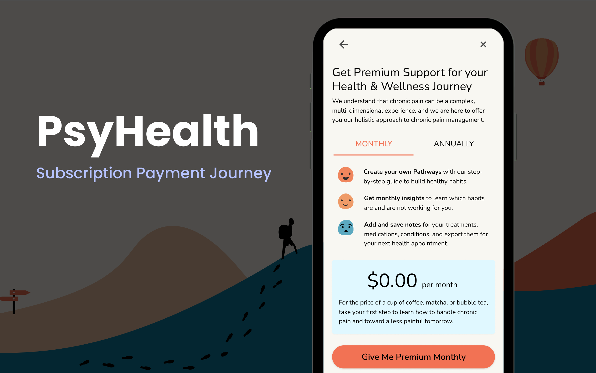
First iteration of the Subscription‐Payment journey, focusing on defining the user flow of steps before and after the journey.
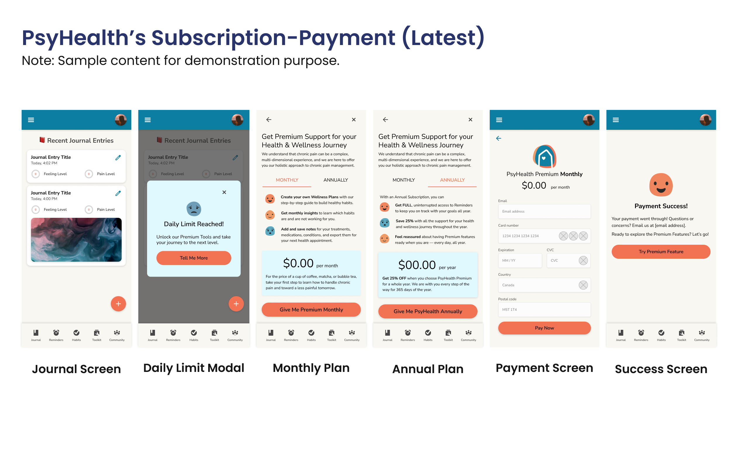
Latest iteration of the Subscription‐Payment journey, prioritizing visual interest and user engagement to foster excitement and trust.
For Future Phases
With additional resources, I would:
- Localize the app for diverse regions and languages in Canada to improve accessibility
- Expand user journey mapping to uncover pre–payment engagement and opportunities.
- Establish a Design System to ensure style consistency with external libraries like Stripe's Payment Integration.
Update: The Design System is in Progress!
I audited and reorganized the components, colours, and patterns to eliminate unused styles and ensure seamless design–development alignment.
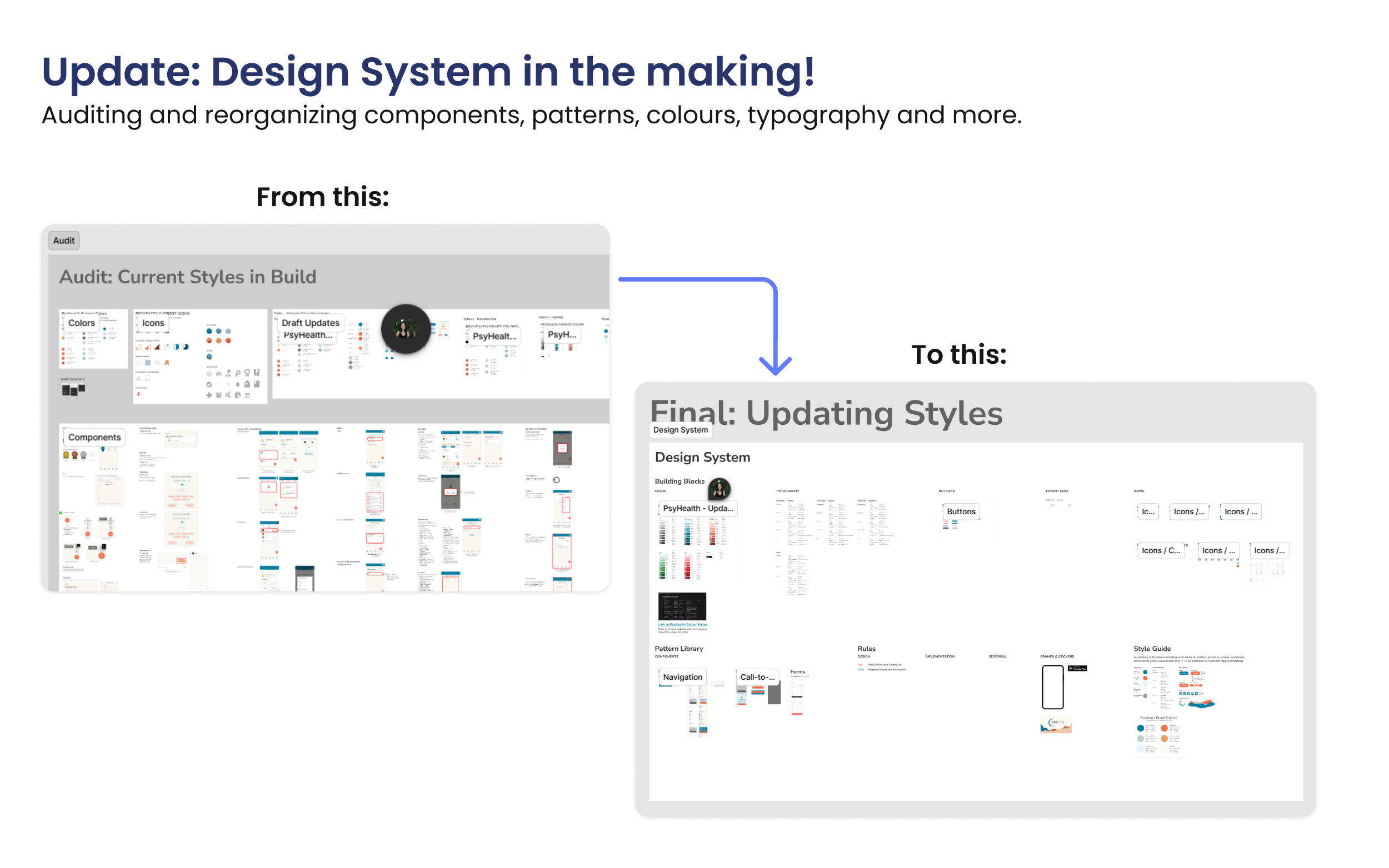
Before and Now captures of the Audited and Working Design System tracker.