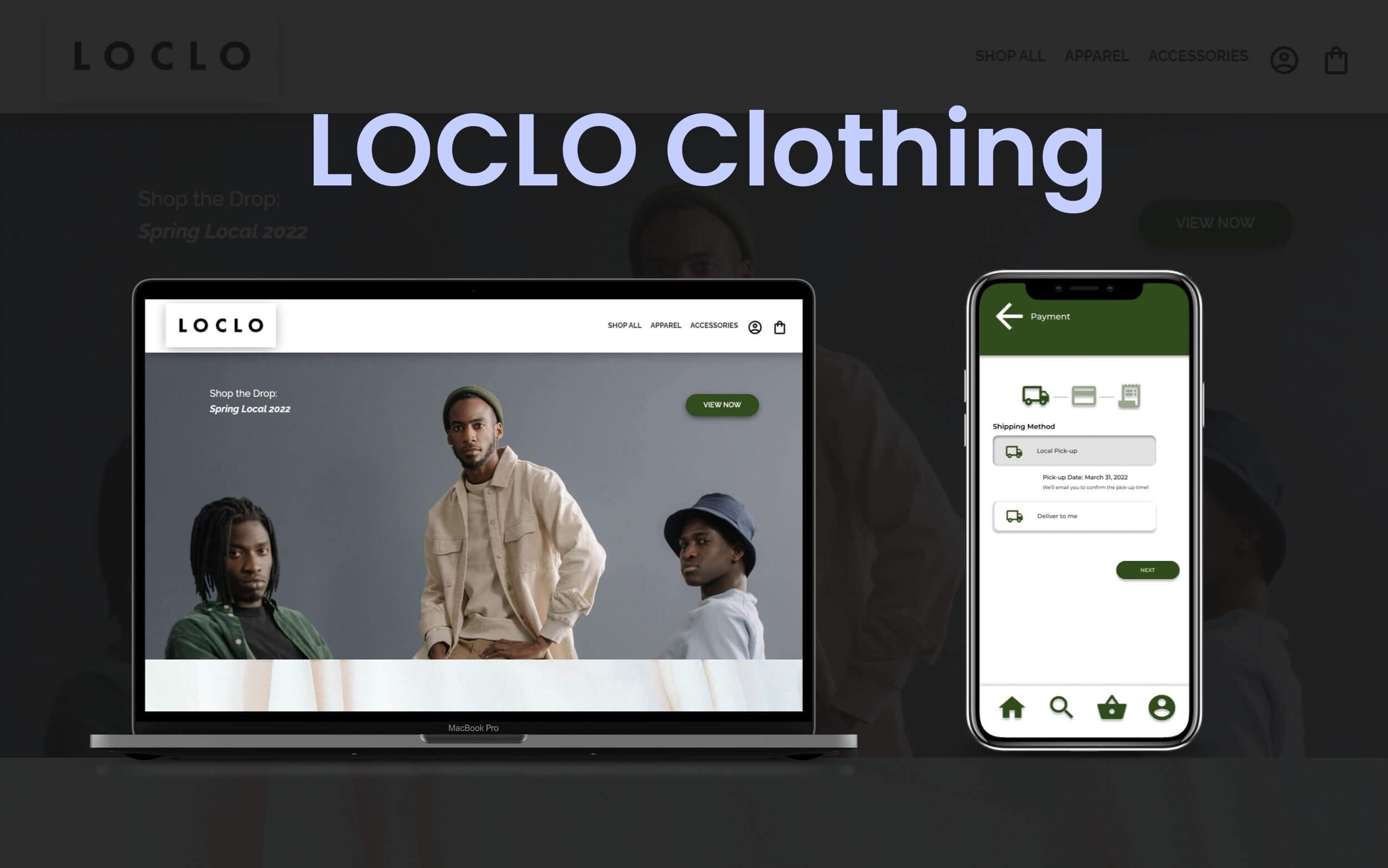
LOCLO Clothing
Project: Responsive Web Design for Cross‐Platform Project
Role: UX Designer, UX Researcher (Unmoderated Usability Testing)
Timeline: 5 Weeks
Project Vision
LOCLO is a local, fictional, small business providing ethically made minimalist apparel from sustainably sourced materials.
The goal for this project focused on creating simple Account Login and Checkout processes to build a strong relationship with local shoppers through the curbside pick‐up option.
Prioritizing a simple yet effective Login and Checkout process is a shared goal across the dedicated mobile application and responsive website for LOCLO Clothing.
Challenges
With consideration of the project's scope, budget, and timeline, the challenges for the responsive website portion of this cross‐platform project* include the following:
- Design for users who have short attention spans
- Design for a consistent shopping experience on the website and the mobile application
- Test and revise the shopping experience to feel less overwhelming
- Resolve abandoned shopping cart user journeys
- Add a local pick‐up option to the delivery method to align with the brand's eco-friendly initiative
*Please Note: The LOCLO Mobile App UX Case Study is a work in progress. Updates are coming soon!
Empathize
Researching
For the LOCLO Clothing project, I combined my knowledge from past projects, like the Vancity Sushi project and The Sweat Crew project, to design a cohesive cross‐platform experience.
Research Goals: The primary goal is to understand the user's expectations for a cross‐platform experience on both the website and mobile application interfaces, create a cohesive experience to maintain brand consistency for both experiences, and make the experience accessible and user‐friendly.
Research Questions:
- What do users expect to see to navigate the website more intuitively?
- How does a user feel about navigating the website?
- What challenges do users face when browsing the products and placing an order?
- What are some ways to improve the experience?
- How likely would users return to place another order in the future based on their experience?
- What are the disregarded pain points in the low‐fidelity prototype?
Research Findings & Pain Points
The User Research process started with looking for direct and indirect competitors. I empathized with users by visiting similar clothing websites to LOCLO Clothing's offerings to understand the user flow and user journey that LOCLO's users would experience when searching and ordering clothes online.
After researching and testing competitors' websites and inquiring about mobile-to-website shopping experiences through one‐on‐one user interviews, I found two primary pain points to resolve in this project's iteration:
- Lack of Consistency: Some participants commented that they wanted more time to learn how to use the mobile application because the placement of elements was different compared to their expectations based on the website experience.
- Long Shopping Experience on Mobile: Optimizing the number of steps for the shopping and checkout processes can help with abandoned and frustrating user experiences.
In addition to the initial challenges previously outlined, these pain points provide a more narrow focus.
Identifying pain points helps designers like myself learn how designers to make custom ordering experiences more enjoyable, especially since a lot of details are needed to complete the order.
Competitive Analysis
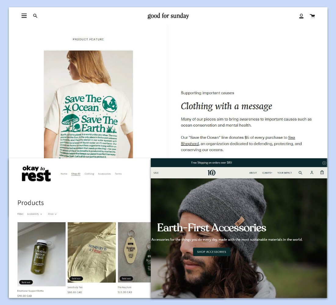
Screenshots of LOCLO Clothing's competitors, Good for Sunday, Okay to Rest, and Tentree
Since LOCLO Clothing's goals are to prioritize local shoppers, focus on only clothing products, and have a niche audience to target social media users, its competitors include Good for Sunday, Okay to Rest, Tentree, and DRMERS CLUB.
The primary weaknesses observed include the following:
- Lack of support for abandoned experiences
- Lack of support for local shopping options during checkout
- Little support for Saved Items/Favourited items for shoppers to resume their journey at a later time
Meet the Persona
The demographic for LOCLO Clothing's users consists of 18 to 29‐year‐olds who want to shop for themselves from an online interface that is based in a local city near them in the primary target audience group, followed by 30 to 40‐year‐olds in the secondary group who would shop for someone else they know.
I spoke with 5 participants who want quality, sustainably sourced clothing from Canada and can imagine themselves shopping at an online e‐commerce store or mobile application like LOCLO&period
Persona Summary for Sarah Smith
Sarah studies Environmental Sciences and Statistics at the University of Victoria. Sarah tries to find affordable clothing from local online businesses, but most online merchants she discovered require more than $100 purchases to get free shipping.
The top goals and frustrations of this persona include the following:
Goals:
- Become an Environmental Policy Analyst for Vancouver
- Live sustainably by shopping locally
- Save money by reducing spending on poor‐quality items to move out and build her greenhouse
Frustrations:
- Shops in nearby neighbourhood are all fast fashion options and have poor material quality
- Local thrift shops lack variety in styles and sizing
- Challenging to find locally, sustainably made loungewear that is designed in an aesthetically pleasing way
- Cannot shop online nor opt for local pickup from local merchants or local thrift shops
A user‐friendly experience aligns with Sarah's values of saving time and money by investing in quality, long‐lasting items made and shipped locally within Canada.
With a persona established, the research process proceeded to learn more about LOCLO Clothing's competitors.
Outlining the Journey
Considering the needs for this project and the persona's User Journey, the following flowchart outlines the users' journey from visiting the website for the first time to the purchase confirmation screen.
Mobile users would be prompted with a similar user flow but with a default prompt to create an account or sign in before beginning their shopping experience.
User Scenario & User Journey Flowchart
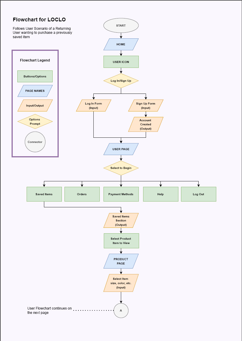
User Journey Flowchart Part 1, up to and including selecting the colour, size, and quantity of item to add to cart
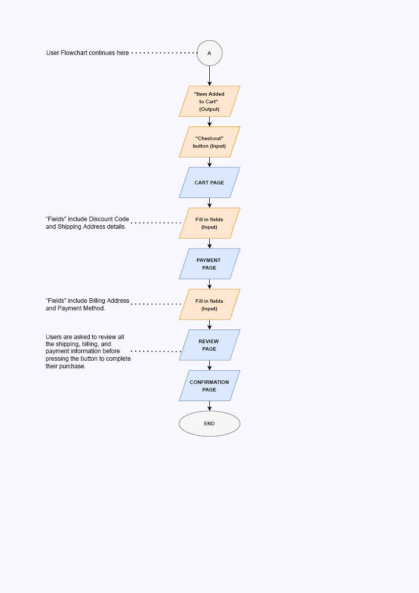
User Journey Flowchart Part 2, up to and including the payment confirmation page
In the User Journey Flowchart Map, the persona, Sarah, discovers LOCLO, a local small business selling sustainably made loungewear. She browses their website and saves an item to purchase later after creating an account on the website.
Sarah returned to the LOCLO website and logged into her account to revisit her saved item. Sarah views the item again on the product page. She explores the product by selecting the available colors, quantity, and size (after checking the size chart) before adding the item to the cart.
From there, Sarah begins the checkout process to complete her first purchase on LOCLO's website.
Define
User Problem Statement
After analyzing the competitors and understanding the users within the primary target audience, I created a User Problem Statement using the following format,
“[User name] is a/an [user characteristics] who needs [user need] because [insight].”
For LOCLO's website experience, the user problem statement for the Sarah Smith persona is as follows:
“[Sarah Smith] is a [busy student and barista] who needs [a simple and reliable online clothing store that sells and delivers loungewear locally] because [she wants to purchase quality clothes from a local merchant to live by her values by supporting local small businesses].”
User Goal Statement
From defining the user goal statement, the user's goal statement can be formed to synthesize how LOCLO's website will perform to positively impact users like the Sarah Smith persona to deliver a valuable experience. How the impact will be measured will also be noted in the user goal statement in the following format:
“Our [product (what)] will let users [perform specific actions (what)] which will affect [describe who the action will affect (who)] by [describe how the action will positively affect users (why)]. We will measure effectiveness by [describe how you will measure the impact].”
For LOCLO's website experience, the user goal statement is as follows:
“Our [online website shopping experience] will let users [browse, save, purchase, and receive their orders with a local pick‐up option] which will affect [the users' values in shopping more environmentally friendly and remove the delivery fee to help users save money and allocate it toward the clothes they want to prioritize].
We will measure effectiveness by [observing the number of local pick‐up orders monthly and quarterly] to assess if this local delivery pick‐up option meets our users' needs and values.”
Site Mapping
To align with LOCLO's brand of simplicity and minimalism, the navigation and site map aligned with these values to reduce information overload and redirect users to the product items first and immediately.
The global navigation menu includes 5 links to meet the fictional client's navigation criteria proposed of having a simple and minimal menu featuring only the essential items. The global navigation menu included the “Shop All”, “Apparel”, “Accessories”, “Login”, and “Cart” links.
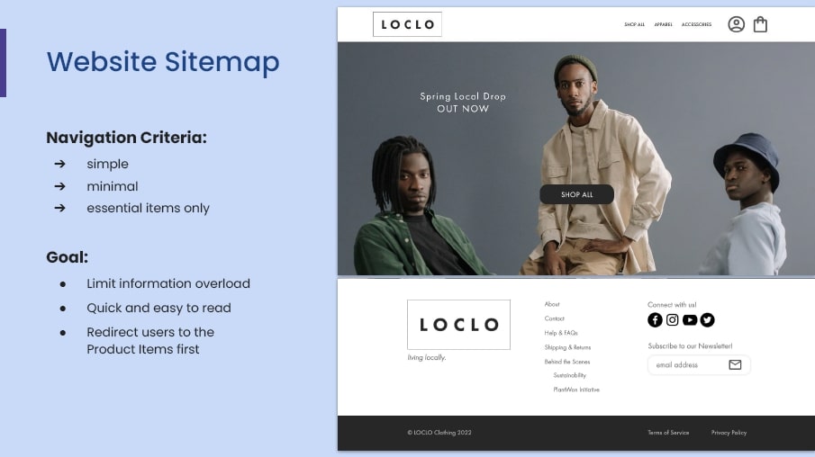
Summary of Website Sitemap in Mockup
The goals of a minimum viable product criteria applied to the global navigation are to limit information overload, make it quick and easy to read, and redirect users to focus on the client's current offerings in their shop at the time.
As for the footer navigation, additional support links were added, such as the “About”, “Contact”, “Help and FAQs”, “Shipping & Returns”, and “Behind the Scenes” links.
The purpose of the footer navigation is to assist shoppers with technical questions, while the focus of the global navigation menu addresses the users' and shoppers' curiosities about the shop's current products.
Ideate
Wireframing
Utilizing the Crazy Eights method, I sketched multiple variations for each screen of the primary user flow to include the most valuable and effective elements to feature for each screen.
After finalizing the sketches, I made digital, low‐fidelity wireframes to optimize the layout of the elements for specific screen sizes across the website and mobile application screens.
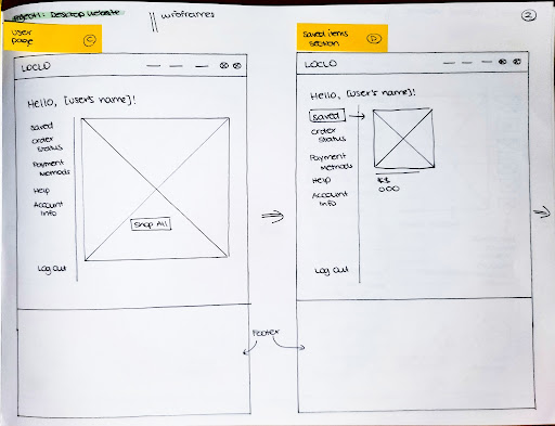
Pen & Paper Wireframes of Account Page on Website
Digital Low‐Fidelity Wireframe of Account Page on Website
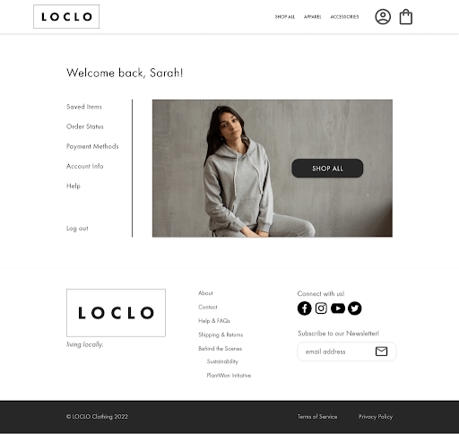
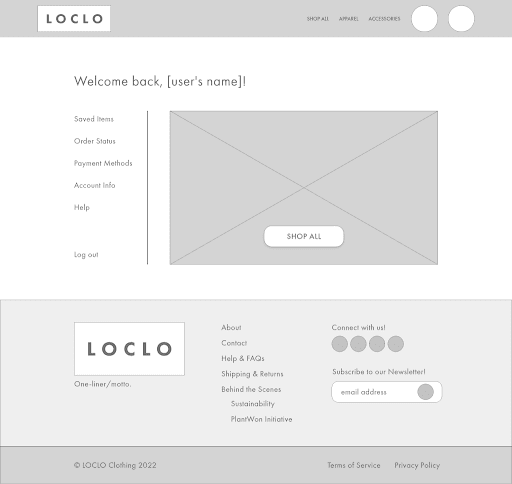
Digital High‐Fidelity Mockup of Account Page on Website
Prototype
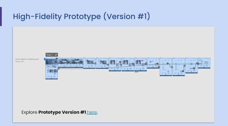
Screenshot of the first iteration of LOCLO Clothing Website's High‐fidelity Prototype
For the course's scope, low‐fidelity and high‐fidelity prototypes were made before the usability study. The purpose of the usability study focused on improving the high‐fidelity prototype given the limited time constraints for this course's project.
Explore the first iteration of the high‐fidelity prototype here.
Test & Iterate
I conducted an unmoderated usability study using the Useberry testing tool to determine how intuitive the first version of the high‐fidelity prototype is based on a specific path users need to execute.
Method: Throughout the usability test, the questions below can be answered to improve the initial high‐fidelity prototype design for a more accessible and intuitive shopping experience for the primary (and secondary) target audience.
With a more straightforward shopping experience, the design can reduce the chances of abandoned checkout and user experience rates to support the company's quarterly and financial goals.
Questions to Address:
- How can the designs be modified to be more intuitive for users to complete the tasks?
- How can the checkout process be optimized (to reduce abandoned cart rates)?
- What could users need clarification about that leads to an abandoned shopping experience?
Based on the user scenario and user flow, the tasks for the usability study were as follows:
- Log in to Account (on the Home page)
- Find Saved Items (on the Account page)
- View Saved Items (on the Account page)
- Add Saved Item to Cart (visit the Product page and add from the Product page)
- Proceed to Checkout (from the Cart Pop-up Modal Box)
- Complete Your Purchase (from the Cart page to the Confirmation page)
After each task, I added a call‐to‐action prompt, “Where would you click to complete [said task]?” to include the tasks at each step of the study.
When users complete the tasks in the study, they are asked to answer four questions about their experience engaging with the usability test. The questions were as follows:
- How would you rate your experience? (Likert Scale)
- How likely would you share this website with a friend? (Likert Scale)
- What part of the experience do you like the most? (Short Text Answer)
- What part of the experience do you like the least? (Short Text Answer)
After completing the four questions, users are thanked for their time to complete the study.
Explore this Usability Test in preview mode on Useberry.
Usability Study Findings & Solutions
The Usability Test was mostly successful with a 100% completion rate and an average time of 2 minutes and 30 seconds to complete all the tasks. The success rate plummeted from 100% to 80% for Task #3 “View Saved Item” and to 40% for Task #5 “Proceed to Checkout.”
After reviewing the heatmaps and clicks map for each successful and unsuccessful screen, the appropriate solutions concluded to improve the overall level of usability and accessibility are as follows:
- Add a border to the first section item when the user hovers over it on the User Account page.
- Resize and reorganize components to above the fold on the User Account page.
- Remove the drop shadow for the Discount Code field and resize the Checkout Breadcrumb Navigation bar to a smaller size on the Cart page.
- Make the “Cart Items” dropdown smaller (in addition to shrinking the Checkout Breadcrumb Navigation bar) and move input fields above the fold on the Payment page.
- Modify down arrows to appear more clickable like a button to encourage users to review the information before completing checkout on the Review page.
Expected Impact after Updates: Through the above‐suggested solutions, users are expected to feel less confused about how to proceed with the next step, more confident about where to click on a page, and more excited to complete their purchase on the website.
The revised design will also shorten the time taken for the entire process and provide ease of mind for both the users and the company about their purchases and saved items.
Second Iteration Prototype Updates
The new pain points discovered from the Usability Study included insufficient emphasis on call‐to‐action buttons and links and unclear progression for the checkout experience as many users unexpectedly misclicked on non‐clickable areas on the screen.
The following screenshots provide a comparison of the before and after mockups of the screens with the areas of improvement from the first usability study.
🎯 Challenge 1: Design for users who have short attention spans
When reviewing the unmoderated usability testing recordings, I noticed usability participants were spam‐clicking all over the page and not many of them scolded past the fold. I inferred that it seemed like the usability participants could have been confused about where to navigate after reading the prompt.
Changes made: Revised the components on the account page to fit above the fold and added emphasis on the first “Saved Items” tab to help users identify where they are within their LOCLO dashboard.
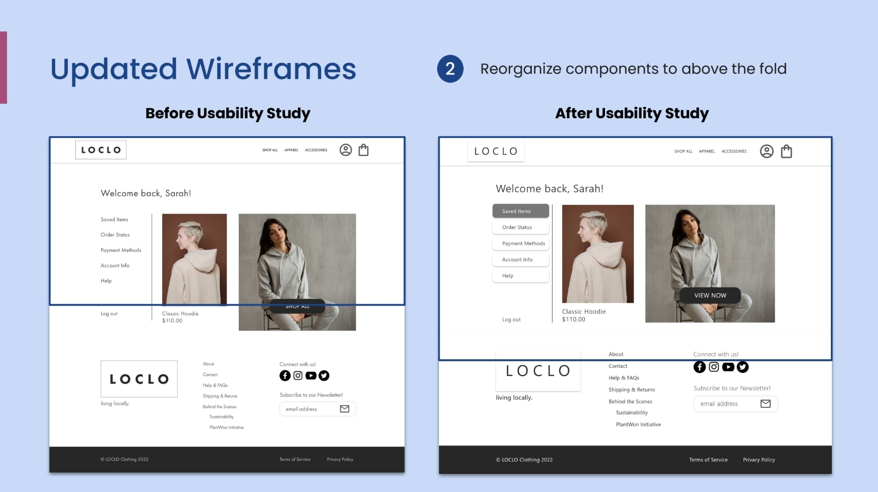
Challenge 1 on Account Page, Before and After Usability Study
🎯 Challenge 2: Resolve abandoned shopping cart user journeys
During the usability study, usability participants were observed clicking the breadcrumb icons to test what the icons could do, not scrolling past the fold, and clicking on the discount code field to trial‐and‐error the next step to continue.
Changes made: Since the prompt for this step was to continue the usability participant's shopping experience by completing the purchase, I reorganized the components and content on the page to fit above the fold to reduce the chances of users abandoning the experience due to not being to see the “Continue” call‐to‐action button above the fold.
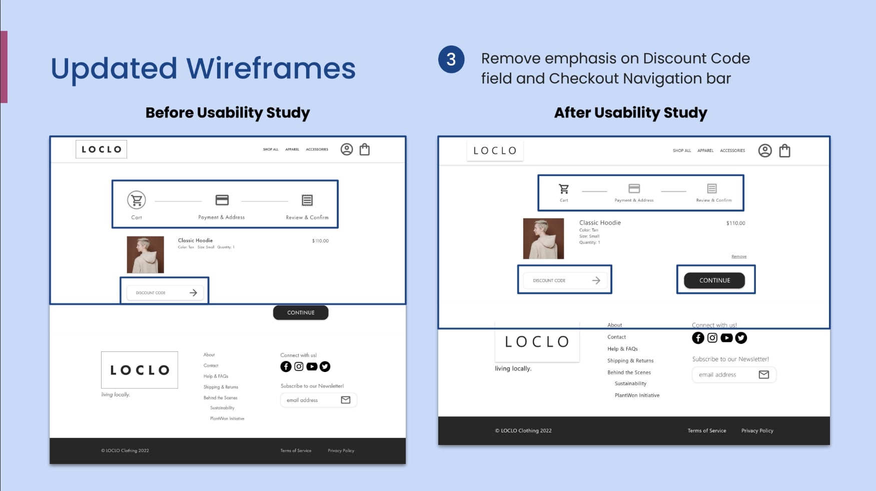
Challenge 2 on Cart Page, Before and After Usability Study
🎯 Challenge 3: Revise shopping experience to feel less overwhelming
Although the focus for the third challenge is not specifically on resolving abandoned shopping experiences, sometimes the long payment input, review, and confirmation can make the final steps of the shopping experience feel long and overwhelming.
I noticed usability testers did not review the information on the payment page before confirming their purchase. From a handful of articles and listening to friends share their stories about incorrect payment information entered for their online purchases, I wanted to ensure LOCLO's online orders did not face a similar issue.
Changes made: Instead of down arrows, I replaced the edit trigger buttons with a pencil icon to encourage users to click the icons as the usability testers proved that users like to trial and error with spam‐clicking the interface (from my observations of this usability study).
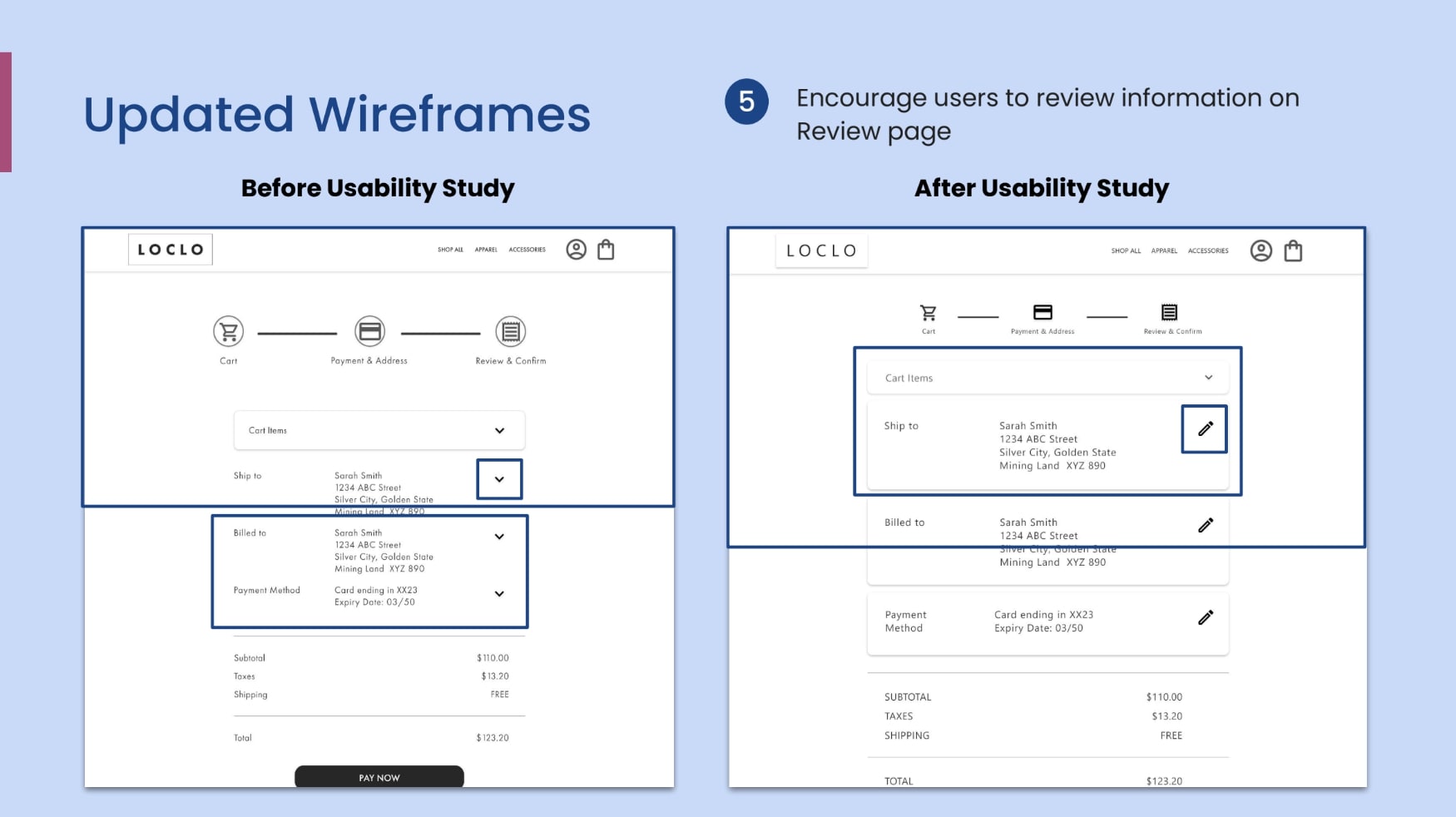
Challenge 3 on Checkout Process, Before and After Usability Study
Check out the second iteration of the high‐fidelity prototype to view the changes.
Takeaways
After completing two prior projects, I learned that I brainstormed different questions to better empathize with the users and identify overlooked pain points from before the research process.
Testing and observing the key differences, strengths, and weaknesses of LOCLO Clothing's competitors helped me better understand how users prioritize visual elements before reading textual content.
One quote from user feedback:
“Seeing saved items were easy to complete and quick to figure out even though it wasn't an expected task.”
— Usability Study Participant
🌱 What I Learned
The usability tests helped me learn more about users' behaviour, such as users preferring to experiment with the interface by selecting any clickable item or rounded element.
Taking note of these actions helped me learn about users' expectations that were not verbally expressed or that all users were aware of their actions.
Most Important: Depending on the designer, sometimes the terms, “wireframes” and “mockups,” can be used interchangeably. I learned about this when comparing notes between instructors and online articles. Note to self, research as much as you can and get to know your audience before the next presentation!
📌 Next Steps
With more time, I would like to add more details and make additional changes to improve the website to be more accessible to users. Here are the first three steps I would want to take:
- Consider Secondary Audience: I would like to learn how a parent or a more mature user navigates the interface and what challenges they would face as word‐of‐mouth is a strong marketing approach for small businesses, and making the website accessible to the secondary audience can help boost traffic and visibility of the website.
- Test again with a more diverse group: With accessibility in mind, I would like to test and learn how to improve the design to support shoppers with a permanent, temporary, or situational disability that prevents them from exploring the entire website or mobile application.
- Create supplementary pages to support the shopping experience: With more pages, users will be navigating additional steps that can make the shopping experience more complex and prone to errors. I would like to create more pages that require different layouts to challenge myself to learn how to improve the design to avoid information overload.
🌿 Thank you for reviewing my work! If you have questions or would like to chat with me about my process, connect with me on LinkedIn! I look forward to learning from your thoughts and feedback. 🥳